- Â
í Assignments
í Unit 14: Jacek Mrowczyk
Q: Can design make a difference?
How and to what extent can design change, or influence the world around us? There have never been times like these: technology, politics, environmental challenges, and social unrest are colliding with remarkable force, shaking the earth and its inhabitants to the core. Can designers make a difference in this complicated world, and if so how? We often hear about design as a tool for change. This Unit asks you to question this premise, to look closely at the world around you, at both large and small-scale issues, and identify areas where design has made change.
For Mon. Nov. 14th
Define the area of design activity (what the project refers to, e.g. improving visual communication of public transport system, discrimination, freedom of speech in the academic units, helping the homeless, hate speech in politics, revitalization of town districts, activating the local community, recycling & environment). Where do you want to have impact? Research into existing solutions (what requires improvement/intervention).
Fill a table with your research. Use the table as your platform to demonstrate the problem.
Learning Objectives
– learning to think critically
– learn to work with unconventional media to create heightened experiences for audiences and users
– develop a critical outlook within the discipline of graphic design
– learn to critically investigate socially involved graphic design (ideology/propaganda/activism)
– define areas where graphic design directly affects users awareness
– paying attention to how design activates social awareness
– consider how to intervene or subvert daily routines in order to communicate a new angle on an existing problem
For Wed. Nov. 16th
Developing three initial concept/solutions designs (sketches, descriptions), including a proper strategy for possible intervention. Print results (any format) and fill a wall surface with your proposals.
For Mon. Nov. 28th in-class
Preparing a presentation (keynote/pdf) of selected initial concept. The presentation should include:
- detailed project description
- implementation strategy/action (for example intervention in public space)
- project’s impact on the surroundings/environment (how the design should work)
- assumed process, changes/results
- suggested project efficacy evaluation method
For Wed. Nov. 30th small groups/brief walk about
Prototype the preliminary design of the implementation strategy/action
For Mon. Dec. 5th/rotate teachers
Presentation of documentations from intervention/action.
For Wed. Dec. 7th/final crit
Walk about / project presentation
Presentation of project’s documentation.
Reading: “Research and Destroy” by Daniel van der Velden
í Unit 13: Persuasion / Overview & Assignment
Unit 13 / Narrative persuasion / Hammett Nurosi
Questions
- How can design be persuasive?
- How does time, timing, framing, and sequence operate when making a visual argument or persuasive message?
- Can designers develop new messages (visual narratives / experiences / memes) by mining existing works of visual art/design?
Unit Summary
In this Unit we are asking you to consider your visual world: one filled with clickable, interactive, time based, and temporal digital information, stories, opinions, and persuasions.
Students will begin to see possibilities in their own work as they practice being persuasive and effective communicators and manipulators of visual language.
Learning Objectives
- To study the basic elements of visual narrative especially in film: framing, image, transition, timing, sequence, point of view (pov), and type of shot (long, medium, close-up).
- To become familiar with mise-en-scène (a term used in film, painting, architecture, etc. which refers to the considered placement and arrangements of elements of a visual composition).
- To explore the tools of rhetoric and persuasion using visual, verbal, and time-based means.
- To consider time, sequence, and editing techniques when framing visual arguments.
- To look at the role of symbol, icon, sign in creating visual/verbal messages
Protocol / Schedule
[Week 1]
Work in groups of 3 (ideally). Work together, and through discussion and analysis develop an understanding of the formal and thematic language of Adam Curtis’s film HyperNormalisation and present your point of view to the whole class in 212 in one week.
DUE OCT 31 MONDAY
Using the film as provocation and/or inspiration, each team will create a five-minute screen-based viewing experience to share with the whole class that establishes an argument and point-of-view (pov) around a particular issue drawn out of the film. (you may use video, keynote, pdf, browser/html etc.)
Consider how your presentation is a provocation — and how your team might employ such techniques as seen in the film, framing, collage, mise-en-scène, sequence, juxtaposition, timing and sound, etc., in order to persuade your audience (us) around a particular issue that you want to address?
Key questions:
- How does HyperNormalisation relate to current social, political and economic conditions?
- How does the author of HyperNormalisation frame the work (is it positioned as documentary? Art? Combination? How is it perceived by its audience and why?)
- What are the techniques and design considerations that are employed in this film; how does it attempt to influence its audience? Consider how information and ideas have been condensed; look at choices of image, music, typography and text, editing, narration, montage, film-clips, silence (“gaps”), advertisements, products, political language (i.e., freedom, democracy, perception management), etc.
- Consider how sequence and order of events works to highlight point-of-view.
Deliverable: Each team will have exactly five minutes to perform their presentations. Among other approaches, we encourage you to consider using screen-based media. Present to the entire class in 212 on Monday, October 31 at 1:10pm.
Persuade [Week 2-3]
Phase Two
Begin Monday Oct 31
Due Monday Nov 14 Nov.
Final project: 2 min (max) screen-based narrative.
The team activity was essentially a group effort of analyzing and comprehending the context: in this case Adam Curtis’s film.
The design from here shifts to students working individually to develop their own content stemming from phase one.
— Consider HyperNormalisation as a system of sign and symbols
Where those elements can be adapted to your ideas and concepts or
Even your design can be built and constructed around sign and symbols.
— Consider at the very basic level HyperNormalisation’s questions while at the same time pointing out the systematic relation between economic, politics and technology.
—Consider the idea of the film’s plot (events in the narrative) and the point of view and style in which the story is told, prior to proceeding with your concepts.
— Start by identifying different elements of group finding and where your own personal interest is and how can interact with it or not.
— Writ, sketch and storyboard your concepts, ideas and study can go further with the notion of screen based media (even as the simplest form of the slides presentations where images follows successively each other with a beginning and ending in real time.
— If you chose to combine or add sound to your image(s) consider the influence and role that (sound) can play and add to the overall impact of your design and movie,
— Consider the fundamental difference of 2D design (print media) with 3D and the presence of movement (even with slides presentation).
— Consider in your design is there a need to use Type and typography, with images and how they can work with each other?
— Your individual project can take a small component from the film (such as a series of sequential still shots, a brief clip, or a collection of curated shots) and create a new “content” and new work that tells a story and express your own point of view and narrative. Also with the ”Hypernormalisation” experience it could
move to a new and different direction that has less relevance to it.
— Your final projects should illustrate a personal point of view. Create a narrative that is more appropriate to your interpretation.
ResourcesFilm
HyperNormalistion (MP4 file)
Reviews of HyperNormalisation
- Adam Curtis: Another Manager of Perceptions
- Hypernormalisation: Adam Curtis plots a path from Syria to Drumpf, via Jane Fonda
The films of Errol Morris
- The Thin Blue Line (full film)
Reading
Understanding Comics: The Invisible Art
Novel by Scott McCloud
Visible Signs (Second Edition): An Introduction to Semiotics
in the Visual Arts by David Crow
Additional Inspiration / References
Michael Wallin, 1988 Decodings
Real Fantasy, Prada, Fall 2012
Perception Management (wikipedia)
Dennis Cooper blog deleted by Google story
Camille Henrot, Grosse Fatigue
The Sprawl (Metahaven)
Holly Herndon, Home (Metahaven)
í Unit 12: Overview & Assignment
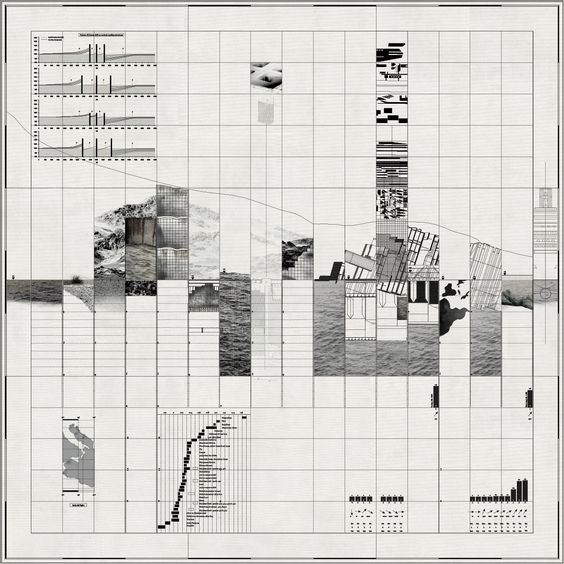
Unit 2 Launch: Monday Oct 3 2016
Lucy’s Opening Intro/Talk on Maps and Mapping
How can designers map?
How does mapping lead to new ways of seeing?
This Unit is about exploring the visual language of maps and as a way to express interests, opinions, observations, or points of view about a physical site and its attending associations, stories, qualities, and intersections.
“Maps can lie, wield power and even start wars. But Mapping, which describes the process of selecting and plotting information spatially, suggests a way of looking beyond the finished artefact, thereby eluding the charges leveled against the map. In recent discourse, mapping emerges from the ashes of the imperial map in a blaze of hopeful rhetoric: it is participatory, generative, revealing, enabling, performative.”
—P. Hall, 2012 from On Mapping and Maps
In the simplest terms, maps are print- or screen-based images that represent land, boundaries, location, or geography. They are produced by cartographers and work to simplify and reduce physical reality into useful and useable 2-dimensional tools.
But some maps describe political, social, artistic, even personal data; they can be factual or fictional; they can be subversive and persuasive. Maps can help to make arguments, point out problems, express quantity, and identify detail. Maps can aggregate one kind of information while omitting another altogether. Maps can act like a lens on a place or frame a point of view.
Learning Goals:
To experience both the craft of making —— and the task of communicating —— with reductive visual elements such as the kind often used in the world of maps and mapping.
To develop a sensitivity to place and space
To practice research methods
To learn to read a site
To transform observations into data, and data into stories
To learn to mine a place for message, idea, story, opinion
To practice abstraction: the act of translating information into readable, abbreviated, and condensed form.
To develop a visual language that can be understood by others.
To become aware of the kinds of work (theoretical, practical, or art-based) that is being produced in the world of mapping, and to see how it might impact a designer’s practice.
In this project you will choose a location — a “site” — to map (ideally near RISD). You will study your site and working from the materials you gather in your analysis, you will explore the possibilities that lie within the language of mapping. The goal will be to design a collection of maps based on the information you uncover and observe about your site, and the stories that might emerge from your observation.
For Mon Oct 3 / First phase
Choose a public site:
Select a site that is meaningful to you in some way.
If possible, it should be a short walking distance of the Design Center.
The site can be an important, interesting, or banal location. It can be a place that is politically or emotionally significant to you, or visually & sensorily compelling. It should be a place where people gather or pass through, such as parks, squares, memorials, monuments, plazas, street corners, etc.
It can be heavily or sparsely populated, but it must be a public space in which people gather or move through with some frequency.
It should not be so big that you can’t visually take it in at once.
Make a quick analysis of your chosen site:
Make note of each of the following 15 aspects / characteristics / qualities (make notes, keywords, photos, sketches). Visit your site at least twice, day and night. Feel free to identify other characteristics not listed here, but include at least these 15:
Categories of Observation (aka Domains)
- Users How do they move through, what are the trajectories, what is
the purpose - Behaviors What are people doing and why are they there? What else is there? Animals? Cars? Children?
- Functionality What is the site used for
- Structures Built or existing elements, lamps, hydrants, benches, pavements, trees, etc. How did they get there, what is their use?
- Material qualities What is the predominant material, underfoot, at eye level, above; how do materials intersect or join?
- Sensory qualities What are the smells, sights, sounds; do they change at different times of day
- Scale Is the place Big Small Cozy Open Closed, etc.
- History What is the site’s history, its reason for being, significant moments or events
- Progression How has it changed; is it still changing
- Geology What lies beneath it; what is its geologic story
- Physical Geography Where is it, how is it shaped and located
- Social Geography Are there class, economic, or civic distinctions or intentions
- Personal What do you feel, think, remember about this site
- What could this site be used for Future potential
- Problems What needs solving or improving
Unit 12 Schedule — Maps and Mapping
Due for Wed. Oct 5 Dig Deeper and Start Mapping
Choose 8 of the 15 categories of observation and do further research and ideation. Show visual evidence of any and all research accomplished. Begin your 8 mappings (size: 10 x 10 in.) one for each category of observation; show drafts/beginnings for 4 mappings.
Due for Mon Oct. 10
Show 8 mappings, on the wall. Show any supportive research.
Consider: layers and strata in your methodology. Consider the relationship between visual mode and meaning. Consider what to show and what to remove
Considerations
Digging deeper and starting mapping
As you commit to 8 (out of 15) categories of observation, be comprehensive as you learn more about your site and begin to develop a position, a statement, or a point of view. The depth of your research should help you determine what (and how) you want to say with your maps.
Mapping
You are graphic designers exploring and innovating around the visual language of maps and mapping. Make 8 visual mappings/maps based on each of eight chosen categories. Your maps should be square —— 10×10 in. (or bigger) and while they can be quick and relatively simple, you should pay close attention to the method you use to visualize your content. How are you controlling your presentation of the information you are expressing. What kind of line, type, image, message. Is a key or legend needed to understand your visual grammar or symbology. How are choosing to simplify, condense, communicate?
Your maps/mappings can be expressive or unconventional but should be legible in some way. They should communicate, and consider appropriate methods and intended message. Develop, and experiment with, different modes of visual language and mapping expressions. You are reducing, simplifying, editing, highlighting, quantifying and locating certain elements. What visual forms make sense for your point of view?
Your 8 maps should attempt to simplify, signify, communicate:
Use the following visualization modes. Choose methods for expressing or delineating your information appropriately:
- Line and shape (vector, hand drawn)
- Graph and symbol
- Image (Photograph, drawing)
- Word (text and type)
- Color (how can color be used to identify certain characteristics)
- Pattern (for differentiation)
- Keys or Legends (for helping your readers)
There will be two more phases;
Then the project culminates on Oct 19
and will end with an exhibit in the GD Commons.
——
Final Phase
Due for Wed, Oct 12
— Show your 8 mappings, refined, and show /proposals/beginning drafts for a 9th more open “map” (This time the dimension and media and form and message are completely open and the focus becomes a more editorial voice, an opinion or point of view). This 9th mapping is the edit. This 9th mapping is the story. It represents what you want to say having done the work of the first 8 mappings, which were your search and research. This final mapping can either utilize aspects from your previous 8 maps or present a new form altogether. How do you stage and frame the story? Consider the installation of your work and the role of typography/language to communicate your project.
Due for Mon Oct 17
9th “map” (new work) show iterations, versions
Due for Wed Oct 19
All 8 maps plus new 9th “map.” Also consider introducing the work back into the site and documenting the site.
Meet in the COMMONS to install the work in an exhibit.
Monday Oct 24 Unit 12 Crit in Commons.
The 9th map
Media for this final “map” is open. This new work should tell a story about the site, or about some component of the site, and should emerge from the first 8 rounds of exploration. It can use elements designed in the first 8 maps, or begin a whole new approach.
A final (optional) step: introduce your “map” to the site!!
Bring an element of your map(s) back into the site itself.
Consider the hows and whys of this / discuss in class–
Media is up to you. Document the final work.
Final install / exhibit in GD Commons Oct 19
Crit in Commons Oct 24
Include:
- Your 8 maps
- Your 9th map
- Documentation of the site with map element(s)
——
From “Between the Map and the Territory”
A thesis by C. Fisher Schwartz
“The map is demonstrative of a basic human impulse, the desire to understand our surroundings and our position within the world. Through the activity of mapmaking, we aspire to comprehend comprehensively, but the very nature of the map allows for only partial understanding. Despite this objective for total knowledge, the blank space of a map is a necessity; in order for a map to be useful it must leave some aspects out. This blank space, along with other blanks in visual representation, is an active silence, and holds meaning in its absence.
While the map attempts to represent a territory, the two become conflated as the map shapes our perception of the space it depicts. As mapping conventions become normalized, the map appears to be an authoritative depiction of a physical space. However, it presents not only what is sensed in the world, but an accumulation of knowledge constructed by society. The map can never reproduce the terrain, but rather combines the real with the representational scheme, the natural with the ideological. We do not simply traverse the physical world but an architecture constructed by the lines of the map.
If exploration is the act of forming a world, then un-discovery is the act of taking it apart, akin to the fracturing of post-modernism. However, in the dissemblance of uncertain times, there is an opportunity to visualize new, alternate spaces, to reconstruct through imagination.” — Carla Lacey Fisher Schwartz
“The city is a living entity, [it is] something far more than a clever configuration of lines. The city changes every day, every hour of the day. It is constantly modifying itself. And it is fully alive in the way it reacts and responds to our actions. It is endlessly fascinating in the same way humans are. They can be exhausting, they can be destructive. But they contain endless possibilities too.” — Rafael Schacter, curator, A(by)P
Links and Resources
(feel free to add more links)
http://www.brooklynstreetart.com/theblog/2015/01/21/50-ways-to-map-the-city-per-street-and-graffiti-artists/#.V_EYopMrLMV
http://learning.blogs.nytimes.com/category/lesson-plans/geography/maps/?_r=0
Watch this
https://www.l2inc.com/about
And then right after watch this (risd alum) Nick Felton:
https://www.youtube.com/watch?v=jpLrq881tGk
Note the way data becomes simplified and mapped to various and multiple categories. How is it persuasive? How is it not?
http://www.janetzweig.com/public/WESTSac.html
https://www.youtube.com/watch?v=ldSkPqZKBl0
http://www.edwardtufte.com/bboard/q-and-a?topic_id=1
https://vimeo.com/117036240 Banjamin Bratton on Stacks
http://thirteen.fibreculturejournal.org/fcj-089-repopulating-the-map-why-subjects-and-things-are-never-alone/
http://marknystrom.com/
http://mapmaker.nationalgeographic.org/#/
http://mthvn.tumblr.com/post/38098461078/thecloudthestateandthestack
Data.gov / US gov’s open source data library, searchable by place (tons of resources for Providence!)
Open Street Map / an open source map resource
Stamen / cartography firm in Boston
NYT election story / excellent example of a clear story told through mapped data
Transit Maps / good blog focused on evolution of transit maps
Denis Wood / and his poetic maps of his neighborhood Boylan Heights, mapping street signs, graffiti, lamps, cars, jack-o-lanterns (This American Life)
his ‘signs’ map (PDF)
And
http://www.believermag.com/issues/201201/?read=interview_wood
http://www.deniswood.net/content/papers/Fine%20Line.pdf
http://visual-memory.co.uk/daniel/Documents/S4B/sem02.html
https://www.theguardian.com/technology/2012/aug/28/google-apple-digital-mapping
https://persuasivemaps.library.cornell.edu/ (thank you Michelle Devlin!)
í Unit 11: Paul Soulellis
Question
How does design make sense of so much stuff?
Unit summary
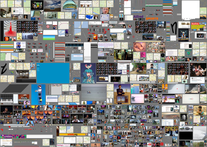
We’re swimming in data. The relentless production of digital material has shifted us into a new condition where the foundation of graphic design — image and language — cannot exist without somehow touching (or being touched by) the internet. Massive archives, from digitized libraries to social media platforms, are part of the new landscape that artists and designers rely on for the production and communication of networked culture. In the face of this overwhelming accumulation of stuff, curation is key. In this unit, we’ll look at how archives, collections and curation can be used to create meaning.
In the face of this massive accumulation of stuff, curation is key. What does this mean?
Curation involves searching for value and constructing meaning by actively engaging with material in a new context. Isolating (and combining), aligning (and disrupting), juxtaposing (and scattering) — these are editorial moves that can create powerful narratives.
By setting up a simple (or complex) relationship between several things, we can tell stories.
In this first unit in DS3, we’ll look at how various techniques, like framing, sequence, montage, and surprise can be used to explore the creation of meaning in and around a collection. Each student will focus on a single archive — found material of your own choosing — as a way to investigate memory, authorship and storytelling.
Learning objectives
- Increase awareness and understanding for the changing nature of content as it relates to design and networked culture
- Learn to position yourself in relation to a specific archive of material and investigate its storytelling potential
- Learn to translate type and imagery into new work (design authorship)
- Learn to assemble, design and communicate ideas into stories using different kinds of media (publishing)
í Reflective Document Deliverable
May 12, 2016
Due May 24
Due May 24
Email your instructor a pdf or a link to your reflective document by the end of day, May 24.
í In Class Peer Critique Activity
May 4, 2016
All sections
All sections
How can you help each other build a more connected and self-sufficient design community?
This will be performed in-class during week 11’s class, May 5th. Read in advance so you can have one of your projects present:
Overview
Meet in groups of 5 (one person per DS section) to review some of your work. Each student will share a project from this year (completed or in-progress), followed by a peer critique and discussion.
Part 1: Presentation
Present your work
—Briefly review the assignment associated with each project or any other pertinent details needed to evaluate your work.
—Explain your intention and point-of-view
—Identify what you’re struggling with, but don’t try to coach or influence reactions; you are looking for objective feedback
Part 2: Written Critique & Discussion
After each presentation, write 3–5 pieces of constructive criticism. Put some thought into your feedback. Discuss within your group. Use the following as suggestions:
—What specific formal design decisions do you admire in the work presented and why? (typography, color, material choice and manipulation, composition, image use, etc.)
—What specific formal design decisions should the student reconsider and why?
—If the work is attempting to communicate, signify, express meaning, etc. is it successful? What does the work mean to you? If the work is not successful, what would you suggest the student do differently?
—Is the work well crafted or not? Does the student appear to care about the final product?
Part 3: Revision
Spend the remaining class time responding to the feedback you were given by revising your existing designs. Share your edits at the end of class.
í Critical Response Workshop
Project
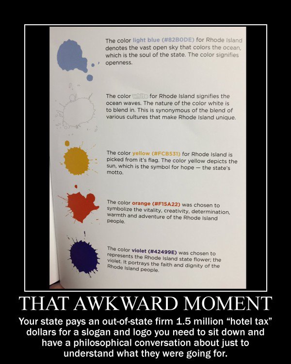
Form a critical response to the new Rhode Island Tourism logo and/or campaign. Your response can be any media and take any form (and should not necessarily be a logo or campaign).
Meet in small groups to discuss and form a point of view, and then work collaboratively or individually to execute your critical response.
Post your work by 5:00 on the second floor for a walkabout immediately following.
Readings/Reference
RI Logo Controversy Press Coverage
NYTimes
The Guardian
AdWeek
AP
RI NPR
Design Community Reaction
Brand New Review
Reddit
Local reaction
Crowd-sourcing contest emerging
Local designers respond
RI Tourism
Visit Rhode Island website
RI Identity Presentation
Logo Design Presentation (alternate logos + taglines)
Other Destination Branding
“Best and Worst” Tourism Logos
Canada (Bruce Mau)
I love New York / Catskills (Milton Glaser)
Deep Reads
RI State Tourism Hearing
Internet Reaction
í Unit 10: Assignment
Choose a manual action to automate, or choose an automated process to make manual.
This assignment asks you to consider how what we make as designers effects human interactions on the micro and macro scale.
Note your everyday actions; go out of your way to notice where technology is present. When do human interactions occur? How would the introduction of automation enhance or hinder the interaction. What would the advantages or disadvantages be if automation took over? How can you use sarcasm, exaggeration, appropriated voice to make a point?
For next week: Make a Keynote presentation showing your source material, and propose various possible re-envisionings. Your proposal may use: other designer’s work as reference, texts, sketches, actual designs, etc.
How are the scenarios different? What is your point of view about technology’s social role through the project you are proposing?
Extended portion
Given the feedback you received from this week, adjust your concept (reinforce your values, rereread learning objectives) and start working on a prototype of your proposal. Make a ton of work.
í Unit 9: Overview and Assignment
Question
How can we begin to communicate a complex idea or action using an economical
combination of words, type, and image?
Overview
Identity design is a critical skill practiced by graphic designers. Before an entity (be it a
company, organization, or cause) can create collateral, launch websites, pitch products
or conduct campaigns, that entity must have a well-conceived identity. A well-conceived
identity, however, is not just a memorable mark (logo), it is also a carefully considered
synthesis of language and typography, image and environment. For this unit, students will
attempt to encapsulate a socially responsible cause (e.g. light pollution, or eliminating
land mines) using a simple yet sophisticated combination of words, type, and image. The
resulting logos or logotypes may serve as a catalyst for further investigation into identity
systems, messaging, or audience engagement.
Learning Objectives
1 Week: Communicate a complex issue using minimal content and form (identity design)
3 Week: Add additional layers of content and form by creating an identity system or visual
language. Using your new visual language, explore unconventional methods and media for
communicating your cause.
Download write-up
Extended Portion
í Unit 8: Overview & Assignment
Question
How can we make the intangible tangible?
Unit Summary
You will find 50 ways to lend form to a common action or gesture. Designers today are tasked with inventing forms that address large abstract problems and communicate across multiple contexts. We will examine what happens when we use iteration as a way of making the intangible tangible, and discover how the process itself can be a material to build meaning with. Ultimately, this method of repetitive formal inquiry is a means to clarify and convey a nuanced idea.
Assignment
In class, you will receive an intangible action. Over the course of the week, investigate the action by creating 50 pieces that express, clarify the action to make it visible and tangible. Your goal is not only to explore multiple expressions of this action, but to force a reconsideration of its archetypal form through a process of iteration and experimentation.
In order to create a vast range of approaches, you should employ both traditional and non-traditional design tools—ranging from analog to digital—to create both static and dynamic executions. As you work, consider how each iteration and tool opens a unique opportunity to communicate something new and unexpected about this action, and do it in a novel way.
For next week, present all 50 visual expressions of your action in a 1920 x 1068 horizontal keynote presentation. Consider how the presentation of these iterations will work both individually and together, and potentially give insight into the tools and the process of how your worked.
Learning Objectives
—Use iteration as a means to understand/communicate nuanced content
—Create tangible form to convey intangible ideas
—Express an idea from multiple perspectives
—Gain comfort with a range of tools
—Present work and process to convey a story
Extended Portion (3 week portion)
How can we make the intangible into an app?
You will propose and design an app that uses your given action as its primary function. The app should deploy the action as a means to do something you care about in a faster, better, or more exciting way.
Approach the project in three steps:
1. Propose what the app does.
Write a brief description of what the app does, how it works, who it’s for, why it’s important.
2. Show what the app looks like.
Design the name and brand for the app (including the app icon, two basic screens and a poster announcing it.
3. Explain the use / outcome of the app.
Make short video or slideshow that presents and celebrates the use/outcome of the app. This will use elements from 1+2 above.
