


| September 9, 2015 |
Unit 1: Overview & LectureJohn |
|
| September 9, 2015 |
Unit 1: Due week 2John |
|
| September 9, 2015 |
Unit 1: Day 1, In-classJohn |
|
| September 9, 2015 |
B Unit 1: ReadingsJohn |
|
| September 9, 2015 |
Unit 1: Due week 3John |
|
| September 21, 2015 |
Observation TipsJohn |
|
| September 24, 2015 |
w Helpful List of Formats, Process and ConceptsMichelle Bowers |
|
| August 31, 2016 |
David Lynch on how observation leads to ideasJohn |
Design Studio 2015—17
Log in
- Ê
- Â
Q: Can design make a difference?
How and to what extent can design change, or influence the world around us? There have never been times like these: technology, politics, environmental challenges, and social unrest are colliding with remarkable force, shaking the earth and its inhabitants to the core. Can designers make a difference in this complicated world, and if so how? We often hear about design as a tool for change. This Unit asks you to question this premise, to look closely at the world around you, at both large and small-scale issues, and identify areas where design has made change.
For Mon. Nov. 14th
Define the area of design activity (what the project refers to, e.g. improving visual communication of public transport system, discrimination, freedom of speech in the academic units, helping the homeless, hate speech in politics, revitalization of town districts, activating the local community, recycling & environment). Where do you want to have impact? Research into existing solutions (what requires improvement/intervention).
Fill a table with your research. Use the table as your platform to demonstrate the problem.
Learning Objectives
– learning to think critically
– learn to work with unconventional media to create heightened experiences for audiences and users
– develop a critical outlook within the discipline of graphic design
– learn to critically investigate socially involved graphic design (ideology/propaganda/activism)
– define areas where graphic design directly affects users awareness
– paying attention to how design activates social awareness
– consider how to intervene or subvert daily routines in order to communicate a new angle on an existing problem
For Wed. Nov. 16th
Developing three initial concept/solutions designs (sketches, descriptions), including a proper strategy for possible intervention. Print results (any format) and fill a wall surface with your proposals.
For Mon. Nov. 28th in-class
Preparing a presentation (keynote/pdf) of selected initial concept. The presentation should include:
- detailed project description
- implementation strategy/action (for example intervention in public space)
- project’s impact on the surroundings/environment (how the design should work)
- assumed process, changes/results
- suggested project efficacy evaluation method
For Wed. Nov. 30th small groups/brief walk about
Prototype the preliminary design of the implementation strategy/action
For Mon. Dec. 5th/rotate teachers
Presentation of documentations from intervention/action.
For Wed. Dec. 7th/final crit
Walk about / project presentation
Presentation of project’s documentation.
Reading: “Research and Destroy” by Daniel van der Velden
Unit 13 / Narrative persuasion / Hammett Nurosi
Questions
- How can design be persuasive?
- How does time, timing, framing, and sequence operate when making a visual argument or persuasive message?
- Can designers develop new messages (visual narratives / experiences / memes) by mining existing works of visual art/design?
Unit Summary
In this Unit we are asking you to consider your visual world: one filled with clickable, interactive, time based, and temporal digital information, stories, opinions, and persuasions.
Students will begin to see possibilities in their own work as they practice being persuasive and effective communicators and manipulators of visual language.
Learning Objectives
- To study the basic elements of visual narrative especially in film: framing, image, transition, timing, sequence, point of view (pov), and type of shot (long, medium, close-up).
- To become familiar with mise-en-scène (a term used in film, painting, architecture, etc. which refers to the considered placement and arrangements of elements of a visual composition).
- To explore the tools of rhetoric and persuasion using visual, verbal, and time-based means.
- To consider time, sequence, and editing techniques when framing visual arguments.
- To look at the role of symbol, icon, sign in creating visual/verbal messages
Protocol / Schedule
[Week 1]
Work in groups of 3 (ideally). Work together, and through discussion and analysis develop an understanding of the formal and thematic language of Adam Curtis’s film HyperNormalisation and present your point of view to the whole class in 212 in one week.
DUE OCT 31 MONDAY
Using the film as provocation and/or inspiration, each team will create a five-minute screen-based viewing experience to share with the whole class that establishes an argument and point-of-view (pov) around a particular issue drawn out of the film. (you may use video, keynote, pdf, browser/html etc.)
Consider how your presentation is a provocation — and how your team might employ such techniques as seen in the film, framing, collage, mise-en-scène, sequence, juxtaposition, timing and sound, etc., in order to persuade your audience (us) around a particular issue that you want to address?
Key questions:
- How does HyperNormalisation relate to current social, political and economic conditions?
- How does the author of HyperNormalisation frame the work (is it positioned as documentary? Art? Combination? How is it perceived by its audience and why?)
- What are the techniques and design considerations that are employed in this film; how does it attempt to influence its audience? Consider how information and ideas have been condensed; look at choices of image, music, typography and text, editing, narration, montage, film-clips, silence (“gaps”), advertisements, products, political language (i.e., freedom, democracy, perception management), etc.
- Consider how sequence and order of events works to highlight point-of-view.
Deliverable: Each team will have exactly five minutes to perform their presentations. Among other approaches, we encourage you to consider using screen-based media. Present to the entire class in 212 on Monday, October 31 at 1:10pm.
Persuade [Week 2-3]
Phase Two
Begin Monday Oct 31
Due Monday Nov 14 Nov.
Final project: 2 min (max) screen-based narrative.
The team activity was essentially a group effort of analyzing and comprehending the context: in this case Adam Curtis’s film.
The design from here shifts to students working individually to develop their own content stemming from phase one.
— Consider HyperNormalisation as a system of sign and symbols
Where those elements can be adapted to your ideas and concepts or
Even your design can be built and constructed around sign and symbols.
— Consider at the very basic level HyperNormalisation’s questions while at the same time pointing out the systematic relation between economic, politics and technology.
—Consider the idea of the film’s plot (events in the narrative) and the point of view and style in which the story is told, prior to proceeding with your concepts.
— Start by identifying different elements of group finding and where your own personal interest is and how can interact with it or not.
— Writ, sketch and storyboard your concepts, ideas and study can go further with the notion of screen based media (even as the simplest form of the slides presentations where images follows successively each other with a beginning and ending in real time.
— If you chose to combine or add sound to your image(s) consider the influence and role that (sound) can play and add to the overall impact of your design and movie,
— Consider the fundamental difference of 2D design (print media) with 3D and the presence of movement (even with slides presentation).
— Consider in your design is there a need to use Type and typography, with images and how they can work with each other?
— Your individual project can take a small component from the film (such as a series of sequential still shots, a brief clip, or a collection of curated shots) and create a new “content” and new work that tells a story and express your own point of view and narrative. Also with the ”Hypernormalisation” experience it could
move to a new and different direction that has less relevance to it.
— Your final projects should illustrate a personal point of view. Create a narrative that is more appropriate to your interpretation.
ResourcesFilm
HyperNormalistion (MP4 file)
Reviews of HyperNormalisation
- Adam Curtis: Another Manager of Perceptions
- Hypernormalisation: Adam Curtis plots a path from Syria to Drumpf, via Jane Fonda
The films of Errol Morris
- The Thin Blue Line (full film)
Reading
Understanding Comics: The Invisible Art
Novel by Scott McCloud
Visible Signs (Second Edition): An Introduction to Semiotics
in the Visual Arts by David Crow
Additional Inspiration / References
Michael Wallin, 1988 Decodings
Real Fantasy, Prada, Fall 2012
Perception Management (wikipedia)
Dennis Cooper blog deleted by Google story
Camille Henrot, Grosse Fatigue
The Sprawl (Metahaven)
Holly Herndon, Home (Metahaven)
Unit 2 Launch: Monday Oct 3 2016
Lucy’s Opening Intro/Talk on Maps and Mapping
How can designers map?
How does mapping lead to new ways of seeing?
This Unit is about exploring the visual language of maps and as a way to express interests, opinions, observations, or points of view about a physical site and its attending associations, stories, qualities, and intersections.
“Maps can lie, wield power and even start wars. But Mapping, which describes the process of selecting and plotting information spatially, suggests a way of looking beyond the finished artefact, thereby eluding the charges leveled against the map. In recent discourse, mapping emerges from the ashes of the imperial map in a blaze of hopeful rhetoric: it is participatory, generative, revealing, enabling, performative.”
—P. Hall, 2012 from On Mapping and Maps
In the simplest terms, maps are print- or screen-based images that represent land, boundaries, location, or geography. They are produced by cartographers and work to simplify and reduce physical reality into useful and useable 2-dimensional tools.
But some maps describe political, social, artistic, even personal data; they can be factual or fictional; they can be subversive and persuasive. Maps can help to make arguments, point out problems, express quantity, and identify detail. Maps can aggregate one kind of information while omitting another altogether. Maps can act like a lens on a place or frame a point of view.
Learning Goals:
To experience both the craft of making —— and the task of communicating —— with reductive visual elements such as the kind often used in the world of maps and mapping.
To develop a sensitivity to place and space
To practice research methods
To learn to read a site
To transform observations into data, and data into stories
To learn to mine a place for message, idea, story, opinion
To practice abstraction: the act of translating information into readable, abbreviated, and condensed form.
To develop a visual language that can be understood by others.
To become aware of the kinds of work (theoretical, practical, or art-based) that is being produced in the world of mapping, and to see how it might impact a designer’s practice.
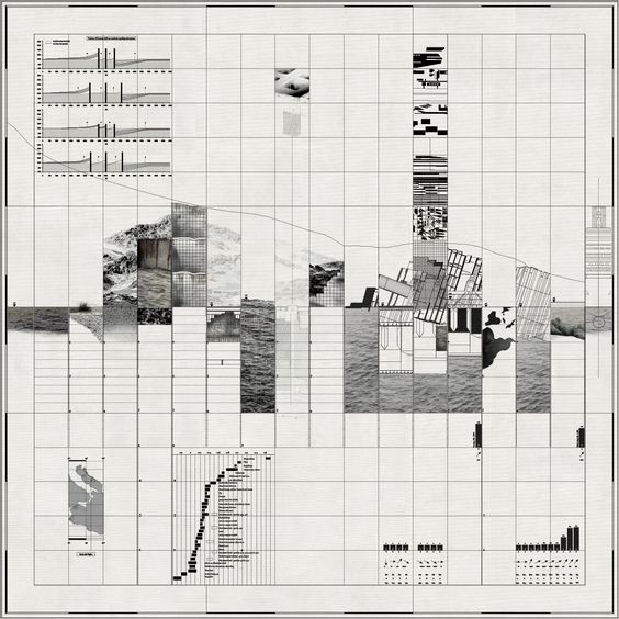
In this project you will choose a location — a “site” — to map (ideally near RISD). You will study your site and working from the materials you gather in your analysis, you will explore the possibilities that lie within the language of mapping. The goal will be to design a collection of maps based on the information you uncover and observe about your site, and the stories that might emerge from your observation.
For Mon Oct 3 / First phase
Choose a public site:
Select a site that is meaningful to you in some way.
If possible, it should be a short walking distance of the Design Center.
The site can be an important, interesting, or banal location. It can be a place that is politically or emotionally significant to you, or visually & sensorily compelling. It should be a place where people gather or pass through, such as parks, squares, memorials, monuments, plazas, street corners, etc.
It can be heavily or sparsely populated, but it must be a public space in which people gather or move through with some frequency.
It should not be so big that you can’t visually take it in at once.
Make a quick analysis of your chosen site:
Make note of each of the following 15 aspects / characteristics / qualities (make notes, keywords, photos, sketches). Visit your site at least twice, day and night. Feel free to identify other characteristics not listed here, but include at least these 15:
Categories of Observation (aka Domains)
- Users How do they move through, what are the trajectories, what is
the purpose - Behaviors What are people doing and why are they there? What else is there? Animals? Cars? Children?
- Functionality What is the site used for
- Structures Built or existing elements, lamps, hydrants, benches, pavements, trees, etc. How did they get there, what is their use?
- Material qualities What is the predominant material, underfoot, at eye level, above; how do materials intersect or join?
- Sensory qualities What are the smells, sights, sounds; do they change at different times of day
- Scale Is the place Big Small Cozy Open Closed, etc.
- History What is the site’s history, its reason for being, significant moments or events
- Progression How has it changed; is it still changing
- Geology What lies beneath it; what is its geologic story
- Physical Geography Where is it, how is it shaped and located
- Social Geography Are there class, economic, or civic distinctions or intentions
- Personal What do you feel, think, remember about this site
- What could this site be used for Future potential
- Problems What needs solving or improving
Unit 12 Schedule — Maps and Mapping
Due for Wed. Oct 5 Dig Deeper and Start Mapping
Choose 8 of the 15 categories of observation and do further research and ideation. Show visual evidence of any and all research accomplished. Begin your 8 mappings (size: 10 x 10 in.) one for each category of observation; show drafts/beginnings for 4 mappings.
Due for Mon Oct. 10
Show 8 mappings, on the wall. Show any supportive research.
Consider: layers and strata in your methodology. Consider the relationship between visual mode and meaning. Consider what to show and what to remove
Considerations
Digging deeper and starting mapping
As you commit to 8 (out of 15) categories of observation, be comprehensive as you learn more about your site and begin to develop a position, a statement, or a point of view. The depth of your research should help you determine what (and how) you want to say with your maps.
Mapping
You are graphic designers exploring and innovating around the visual language of maps and mapping. Make 8 visual mappings/maps based on each of eight chosen categories. Your maps should be square —— 10×10 in. (or bigger) and while they can be quick and relatively simple, you should pay close attention to the method you use to visualize your content. How are you controlling your presentation of the information you are expressing. What kind of line, type, image, message. Is a key or legend needed to understand your visual grammar or symbology. How are choosing to simplify, condense, communicate?
Your maps/mappings can be expressive or unconventional but should be legible in some way. They should communicate, and consider appropriate methods and intended message. Develop, and experiment with, different modes of visual language and mapping expressions. You are reducing, simplifying, editing, highlighting, quantifying and locating certain elements. What visual forms make sense for your point of view?
Your 8 maps should attempt to simplify, signify, communicate:
Use the following visualization modes. Choose methods for expressing or delineating your information appropriately:
- Line and shape (vector, hand drawn)
- Graph and symbol
- Image (Photograph, drawing)
- Word (text and type)
- Color (how can color be used to identify certain characteristics)
- Pattern (for differentiation)
- Keys or Legends (for helping your readers)
There will be two more phases;
Then the project culminates on Oct 19
and will end with an exhibit in the GD Commons.
——
Final Phase
Due for Wed, Oct 12
— Show your 8 mappings, refined, and show /proposals/beginning drafts for a 9th more open “map” (This time the dimension and media and form and message are completely open and the focus becomes a more editorial voice, an opinion or point of view). This 9th mapping is the edit. This 9th mapping is the story. It represents what you want to say having done the work of the first 8 mappings, which were your search and research. This final mapping can either utilize aspects from your previous 8 maps or present a new form altogether. How do you stage and frame the story? Consider the installation of your work and the role of typography/language to communicate your project.
Due for Mon Oct 17
9th “map” (new work) show iterations, versions
Due for Wed Oct 19
All 8 maps plus new 9th “map.” Also consider introducing the work back into the site and documenting the site.
Meet in the COMMONS to install the work in an exhibit.
Monday Oct 24 Unit 12 Crit in Commons.
The 9th map
Media for this final “map” is open. This new work should tell a story about the site, or about some component of the site, and should emerge from the first 8 rounds of exploration. It can use elements designed in the first 8 maps, or begin a whole new approach.
A final (optional) step: introduce your “map” to the site!!
Bring an element of your map(s) back into the site itself.
Consider the hows and whys of this / discuss in class–
Media is up to you. Document the final work.
Final install / exhibit in GD Commons Oct 19
Crit in Commons Oct 24
Include:
- Your 8 maps
- Your 9th map
- Documentation of the site with map element(s)
——
From “Between the Map and the Territory”
A thesis by C. Fisher Schwartz
“The map is demonstrative of a basic human impulse, the desire to understand our surroundings and our position within the world. Through the activity of mapmaking, we aspire to comprehend comprehensively, but the very nature of the map allows for only partial understanding. Despite this objective for total knowledge, the blank space of a map is a necessity; in order for a map to be useful it must leave some aspects out. This blank space, along with other blanks in visual representation, is an active silence, and holds meaning in its absence.
While the map attempts to represent a territory, the two become conflated as the map shapes our perception of the space it depicts. As mapping conventions become normalized, the map appears to be an authoritative depiction of a physical space. However, it presents not only what is sensed in the world, but an accumulation of knowledge constructed by society. The map can never reproduce the terrain, but rather combines the real with the representational scheme, the natural with the ideological. We do not simply traverse the physical world but an architecture constructed by the lines of the map.
If exploration is the act of forming a world, then un-discovery is the act of taking it apart, akin to the fracturing of post-modernism. However, in the dissemblance of uncertain times, there is an opportunity to visualize new, alternate spaces, to reconstruct through imagination.” — Carla Lacey Fisher Schwartz
“The city is a living entity, [it is] something far more than a clever configuration of lines. The city changes every day, every hour of the day. It is constantly modifying itself. And it is fully alive in the way it reacts and responds to our actions. It is endlessly fascinating in the same way humans are. They can be exhausting, they can be destructive. But they contain endless possibilities too.” — Rafael Schacter, curator, A(by)P
Links and Resources
(feel free to add more links)
http://www.brooklynstreetart.com/theblog/2015/01/21/50-ways-to-map-the-city-per-street-and-graffiti-artists/#.V_EYopMrLMV
http://learning.blogs.nytimes.com/category/lesson-plans/geography/maps/?_r=0
Watch this
https://www.l2inc.com/about
And then right after watch this (risd alum) Nick Felton:
https://www.youtube.com/watch?v=jpLrq881tGk
Note the way data becomes simplified and mapped to various and multiple categories. How is it persuasive? How is it not?
http://www.janetzweig.com/public/WESTSac.html
https://www.youtube.com/watch?v=ldSkPqZKBl0
http://www.edwardtufte.com/bboard/q-and-a?topic_id=1
https://vimeo.com/117036240 Banjamin Bratton on Stacks
http://thirteen.fibreculturejournal.org/fcj-089-repopulating-the-map-why-subjects-and-things-are-never-alone/
http://marknystrom.com/
http://mapmaker.nationalgeographic.org/#/
http://mthvn.tumblr.com/post/38098461078/thecloudthestateandthestack
Data.gov / US gov’s open source data library, searchable by place (tons of resources for Providence!)
Open Street Map / an open source map resource
Stamen / cartography firm in Boston
NYT election story / excellent example of a clear story told through mapped data
Transit Maps / good blog focused on evolution of transit maps
Denis Wood / and his poetic maps of his neighborhood Boylan Heights, mapping street signs, graffiti, lamps, cars, jack-o-lanterns (This American Life)
his ‘signs’ map (PDF)
And
http://www.believermag.com/issues/201201/?read=interview_wood
http://www.deniswood.net/content/papers/Fine%20Line.pdf
http://visual-memory.co.uk/daniel/Documents/S4B/sem02.html
https://www.theguardian.com/technology/2012/aug/28/google-apple-digital-mapping
https://persuasivemaps.library.cornell.edu/ (thank you Michelle Devlin!)
Question
How does design make sense of so much stuff?
Unit summary
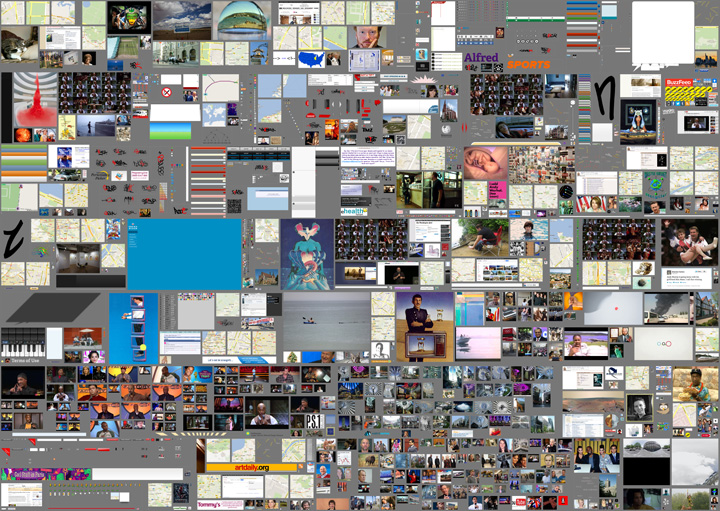
We’re swimming in data. The relentless production of digital material has shifted us into a new condition where the foundation of graphic design — image and language — cannot exist without somehow touching (or being touched by) the internet. Massive archives, from digitized libraries to social media platforms, are part of the new landscape that artists and designers rely on for the production and communication of networked culture. In the face of this overwhelming accumulation of stuff, curation is key. In this unit, we’ll look at how archives, collections and curation can be used to create meaning.
In the face of this massive accumulation of stuff, curation is key. What does this mean?
Curation involves searching for value and constructing meaning by actively engaging with material in a new context. Isolating (and combining), aligning (and disrupting), juxtaposing (and scattering) — these are editorial moves that can create powerful narratives.
By setting up a simple (or complex) relationship between several things, we can tell stories.
In this first unit in DS3, we’ll look at how various techniques, like framing, sequence, montage, and surprise can be used to explore the creation of meaning in and around a collection. Each student will focus on a single archive — found material of your own choosing — as a way to investigate memory, authorship and storytelling.
Learning objectives
- Increase awareness and understanding for the changing nature of content as it relates to design and networked culture
- Learn to position yourself in relation to a specific archive of material and investigate its storytelling potential
- Learn to translate type and imagery into new work (design authorship)
- Learn to assemble, design and communicate ideas into stories using different kinds of media (publishing)
Email your instructor a pdf or a link to your reflective document by the end of day, May 24.
Åw Sophomore review schedule
w Sophomore review schedule May 5, 2016
Åw Sophomore review info
w Sophomore review info May 5, 2016
How can you help each other build a more connected and self-sufficient design community?
This will be performed in-class during week 11’s class, May 5th. Read in advance so you can have one of your projects present:
Overview
Meet in groups of 5 (one person per DS section) to review some of your work. Each student will share a project from this year (completed or in-progress), followed by a peer critique and discussion.
Part 1: Presentation
Present your work
—Briefly review the assignment associated with each project or any other pertinent details needed to evaluate your work.
—Explain your intention and point-of-view
—Identify what you’re struggling with, but don’t try to coach or influence reactions; you are looking for objective feedback
Part 2: Written Critique & Discussion
After each presentation, write 3–5 pieces of constructive criticism. Put some thought into your feedback. Discuss within your group. Use the following as suggestions:
—What specific formal design decisions do you admire in the work presented and why? (typography, color, material choice and manipulation, composition, image use, etc.)
—What specific formal design decisions should the student reconsider and why?
—If the work is attempting to communicate, signify, express meaning, etc. is it successful? What does the work mean to you? If the work is not successful, what would you suggest the student do differently?
—Is the work well crafted or not? Does the student appear to care about the final product?
Part 3: Revision
Spend the remaining class time responding to the feedback you were given by revising your existing designs. Share your edits at the end of class.
í Unit 14: Jacek Mrowczyk
Q: Can design make a difference?
How and to what extent can design change, or influence the world around us? There have never been times like these: technology, politics, environmental challenges, and social unrest are colliding with remarkable force, shaking the earth and its inhabitants to the core. Can designers make a difference in this complicated world, and if so how? We often hear about design as a tool for change. This Unit asks you to question this premise, to look closely at the world around you, at both large and small-scale issues, and identify areas where design has made change.
For Mon. Nov. 14th
Define the area of design activity (what the project refers to, e.g. improving visual communication of public transport system, discrimination, freedom of speech in the academic units, helping the homeless, hate speech in politics, revitalization of town districts, activating the local community, recycling & environment). Where do you want to have impact? Research into existing solutions (what requires improvement/intervention).
Fill a table with your research. Use the table as your platform to demonstrate the problem.
Learning Objectives
– learning to think critically
– learn to work with unconventional media to create heightened experiences for audiences and users
– develop a critical outlook within the discipline of graphic design
– learn to critically investigate socially involved graphic design (ideology/propaganda/activism)
– define areas where graphic design directly affects users awareness
– paying attention to how design activates social awareness
– consider how to intervene or subvert daily routines in order to communicate a new angle on an existing problem
For Wed. Nov. 16th
Developing three initial concept/solutions designs (sketches, descriptions), including a proper strategy for possible intervention. Print results (any format) and fill a wall surface with your proposals.
For Mon. Nov. 28th in-class
Preparing a presentation (keynote/pdf) of selected initial concept. The presentation should include:
- detailed project description
- implementation strategy/action (for example intervention in public space)
- project’s impact on the surroundings/environment (how the design should work)
- assumed process, changes/results
- suggested project efficacy evaluation method
For Wed. Nov. 30th small groups/brief walk about
Prototype the preliminary design of the implementation strategy/action
For Mon. Dec. 5th/rotate teachers
Presentation of documentations from intervention/action.
For Wed. Dec. 7th/final crit
Walk about / project presentation
Presentation of project’s documentation.
Reading: “Research and Destroy” by Daniel van der Velden
í Unit 13: Persuasion / Overview & Assignment
Unit 13 / Narrative persuasion / Hammett Nurosi
Questions
- How can design be persuasive?
- How does time, timing, framing, and sequence operate when making a visual argument or persuasive message?
- Can designers develop new messages (visual narratives / experiences / memes) by mining existing works of visual art/design?
Unit Summary
In this Unit we are asking you to consider your visual world: one filled with clickable, interactive, time based, and temporal digital information, stories, opinions, and persuasions.
Students will begin to see possibilities in their own work as they practice being persuasive and effective communicators and manipulators of visual language.
Learning Objectives
- To study the basic elements of visual narrative especially in film: framing, image, transition, timing, sequence, point of view (pov), and type of shot (long, medium, close-up).
- To become familiar with mise-en-scène (a term used in film, painting, architecture, etc. which refers to the considered placement and arrangements of elements of a visual composition).
- To explore the tools of rhetoric and persuasion using visual, verbal, and time-based means.
- To consider time, sequence, and editing techniques when framing visual arguments.
- To look at the role of symbol, icon, sign in creating visual/verbal messages
Protocol / Schedule
[Week 1]
Work in groups of 3 (ideally). Work together, and through discussion and analysis develop an understanding of the formal and thematic language of Adam Curtis’s film HyperNormalisation and present your point of view to the whole class in 212 in one week.
DUE OCT 31 MONDAY
Using the film as provocation and/or inspiration, each team will create a five-minute screen-based viewing experience to share with the whole class that establishes an argument and point-of-view (pov) around a particular issue drawn out of the film. (you may use video, keynote, pdf, browser/html etc.)
Consider how your presentation is a provocation — and how your team might employ such techniques as seen in the film, framing, collage, mise-en-scène, sequence, juxtaposition, timing and sound, etc., in order to persuade your audience (us) around a particular issue that you want to address?
Key questions:
- How does HyperNormalisation relate to current social, political and economic conditions?
- How does the author of HyperNormalisation frame the work (is it positioned as documentary? Art? Combination? How is it perceived by its audience and why?)
- What are the techniques and design considerations that are employed in this film; how does it attempt to influence its audience? Consider how information and ideas have been condensed; look at choices of image, music, typography and text, editing, narration, montage, film-clips, silence (“gaps”), advertisements, products, political language (i.e., freedom, democracy, perception management), etc.
- Consider how sequence and order of events works to highlight point-of-view.
Deliverable: Each team will have exactly five minutes to perform their presentations. Among other approaches, we encourage you to consider using screen-based media. Present to the entire class in 212 on Monday, October 31 at 1:10pm.
Persuade [Week 2-3]
Phase Two
Begin Monday Oct 31
Due Monday Nov 14 Nov.
Final project: 2 min (max) screen-based narrative.
The team activity was essentially a group effort of analyzing and comprehending the context: in this case Adam Curtis’s film.
The design from here shifts to students working individually to develop their own content stemming from phase one.
— Consider HyperNormalisation as a system of sign and symbols
Where those elements can be adapted to your ideas and concepts or
Even your design can be built and constructed around sign and symbols.
— Consider at the very basic level HyperNormalisation’s questions while at the same time pointing out the systematic relation between economic, politics and technology.
—Consider the idea of the film’s plot (events in the narrative) and the point of view and style in which the story is told, prior to proceeding with your concepts.
— Start by identifying different elements of group finding and where your own personal interest is and how can interact with it or not.
— Writ, sketch and storyboard your concepts, ideas and study can go further with the notion of screen based media (even as the simplest form of the slides presentations where images follows successively each other with a beginning and ending in real time.
— If you chose to combine or add sound to your image(s) consider the influence and role that (sound) can play and add to the overall impact of your design and movie,
— Consider the fundamental difference of 2D design (print media) with 3D and the presence of movement (even with slides presentation).
— Consider in your design is there a need to use Type and typography, with images and how they can work with each other?
— Your individual project can take a small component from the film (such as a series of sequential still shots, a brief clip, or a collection of curated shots) and create a new “content” and new work that tells a story and express your own point of view and narrative. Also with the ”Hypernormalisation” experience it could
move to a new and different direction that has less relevance to it.
— Your final projects should illustrate a personal point of view. Create a narrative that is more appropriate to your interpretation.
ResourcesFilm
HyperNormalistion (MP4 file)
Reviews of HyperNormalisation
- Adam Curtis: Another Manager of Perceptions
- Hypernormalisation: Adam Curtis plots a path from Syria to Drumpf, via Jane Fonda
The films of Errol Morris
- The Thin Blue Line (full film)
Reading
Understanding Comics: The Invisible Art
Novel by Scott McCloud
Visible Signs (Second Edition): An Introduction to Semiotics
in the Visual Arts by David Crow
Additional Inspiration / References
Michael Wallin, 1988 Decodings
Real Fantasy, Prada, Fall 2012
Perception Management (wikipedia)
Dennis Cooper blog deleted by Google story
Camille Henrot, Grosse Fatigue
The Sprawl (Metahaven)
Holly Herndon, Home (Metahaven)
í Unit 12: Overview & Assignment
Unit 2 Launch: Monday Oct 3 2016
Lucy’s Opening Intro/Talk on Maps and Mapping
How can designers map?
How does mapping lead to new ways of seeing?
This Unit is about exploring the visual language of maps and as a way to express interests, opinions, observations, or points of view about a physical site and its attending associations, stories, qualities, and intersections.
“Maps can lie, wield power and even start wars. But Mapping, which describes the process of selecting and plotting information spatially, suggests a way of looking beyond the finished artefact, thereby eluding the charges leveled against the map. In recent discourse, mapping emerges from the ashes of the imperial map in a blaze of hopeful rhetoric: it is participatory, generative, revealing, enabling, performative.”
—P. Hall, 2012 from On Mapping and Maps
In the simplest terms, maps are print- or screen-based images that represent land, boundaries, location, or geography. They are produced by cartographers and work to simplify and reduce physical reality into useful and useable 2-dimensional tools.
But some maps describe political, social, artistic, even personal data; they can be factual or fictional; they can be subversive and persuasive. Maps can help to make arguments, point out problems, express quantity, and identify detail. Maps can aggregate one kind of information while omitting another altogether. Maps can act like a lens on a place or frame a point of view.
Learning Goals:
To experience both the craft of making —— and the task of communicating —— with reductive visual elements such as the kind often used in the world of maps and mapping.
To develop a sensitivity to place and space
To practice research methods
To learn to read a site
To transform observations into data, and data into stories
To learn to mine a place for message, idea, story, opinion
To practice abstraction: the act of translating information into readable, abbreviated, and condensed form.
To develop a visual language that can be understood by others.
To become aware of the kinds of work (theoretical, practical, or art-based) that is being produced in the world of mapping, and to see how it might impact a designer’s practice.
In this project you will choose a location — a “site” — to map (ideally near RISD). You will study your site and working from the materials you gather in your analysis, you will explore the possibilities that lie within the language of mapping. The goal will be to design a collection of maps based on the information you uncover and observe about your site, and the stories that might emerge from your observation.
For Mon Oct 3 / First phase
Choose a public site:
Select a site that is meaningful to you in some way.
If possible, it should be a short walking distance of the Design Center.
The site can be an important, interesting, or banal location. It can be a place that is politically or emotionally significant to you, or visually & sensorily compelling. It should be a place where people gather or pass through, such as parks, squares, memorials, monuments, plazas, street corners, etc.
It can be heavily or sparsely populated, but it must be a public space in which people gather or move through with some frequency.
It should not be so big that you can’t visually take it in at once.
Make a quick analysis of your chosen site:
Make note of each of the following 15 aspects / characteristics / qualities (make notes, keywords, photos, sketches). Visit your site at least twice, day and night. Feel free to identify other characteristics not listed here, but include at least these 15:
Categories of Observation (aka Domains)
- Users How do they move through, what are the trajectories, what is
the purpose - Behaviors What are people doing and why are they there? What else is there? Animals? Cars? Children?
- Functionality What is the site used for
- Structures Built or existing elements, lamps, hydrants, benches, pavements, trees, etc. How did they get there, what is their use?
- Material qualities What is the predominant material, underfoot, at eye level, above; how do materials intersect or join?
- Sensory qualities What are the smells, sights, sounds; do they change at different times of day
- Scale Is the place Big Small Cozy Open Closed, etc.
- History What is the site’s history, its reason for being, significant moments or events
- Progression How has it changed; is it still changing
- Geology What lies beneath it; what is its geologic story
- Physical Geography Where is it, how is it shaped and located
- Social Geography Are there class, economic, or civic distinctions or intentions
- Personal What do you feel, think, remember about this site
- What could this site be used for Future potential
- Problems What needs solving or improving
Unit 12 Schedule — Maps and Mapping
Due for Wed. Oct 5 Dig Deeper and Start Mapping
Choose 8 of the 15 categories of observation and do further research and ideation. Show visual evidence of any and all research accomplished. Begin your 8 mappings (size: 10 x 10 in.) one for each category of observation; show drafts/beginnings for 4 mappings.
Due for Mon Oct. 10
Show 8 mappings, on the wall. Show any supportive research.
Consider: layers and strata in your methodology. Consider the relationship between visual mode and meaning. Consider what to show and what to remove
Considerations
Digging deeper and starting mapping
As you commit to 8 (out of 15) categories of observation, be comprehensive as you learn more about your site and begin to develop a position, a statement, or a point of view. The depth of your research should help you determine what (and how) you want to say with your maps.
Mapping
You are graphic designers exploring and innovating around the visual language of maps and mapping. Make 8 visual mappings/maps based on each of eight chosen categories. Your maps should be square —— 10×10 in. (or bigger) and while they can be quick and relatively simple, you should pay close attention to the method you use to visualize your content. How are you controlling your presentation of the information you are expressing. What kind of line, type, image, message. Is a key or legend needed to understand your visual grammar or symbology. How are choosing to simplify, condense, communicate?
Your maps/mappings can be expressive or unconventional but should be legible in some way. They should communicate, and consider appropriate methods and intended message. Develop, and experiment with, different modes of visual language and mapping expressions. You are reducing, simplifying, editing, highlighting, quantifying and locating certain elements. What visual forms make sense for your point of view?
Your 8 maps should attempt to simplify, signify, communicate:
Use the following visualization modes. Choose methods for expressing or delineating your information appropriately:
- Line and shape (vector, hand drawn)
- Graph and symbol
- Image (Photograph, drawing)
- Word (text and type)
- Color (how can color be used to identify certain characteristics)
- Pattern (for differentiation)
- Keys or Legends (for helping your readers)
There will be two more phases;
Then the project culminates on Oct 19
and will end with an exhibit in the GD Commons.
——
Final Phase
Due for Wed, Oct 12
— Show your 8 mappings, refined, and show /proposals/beginning drafts for a 9th more open “map” (This time the dimension and media and form and message are completely open and the focus becomes a more editorial voice, an opinion or point of view). This 9th mapping is the edit. This 9th mapping is the story. It represents what you want to say having done the work of the first 8 mappings, which were your search and research. This final mapping can either utilize aspects from your previous 8 maps or present a new form altogether. How do you stage and frame the story? Consider the installation of your work and the role of typography/language to communicate your project.
Due for Mon Oct 17
9th “map” (new work) show iterations, versions
Due for Wed Oct 19
All 8 maps plus new 9th “map.” Also consider introducing the work back into the site and documenting the site.
Meet in the COMMONS to install the work in an exhibit.
Monday Oct 24 Unit 12 Crit in Commons.
The 9th map
Media for this final “map” is open. This new work should tell a story about the site, or about some component of the site, and should emerge from the first 8 rounds of exploration. It can use elements designed in the first 8 maps, or begin a whole new approach.
A final (optional) step: introduce your “map” to the site!!
Bring an element of your map(s) back into the site itself.
Consider the hows and whys of this / discuss in class–
Media is up to you. Document the final work.
Final install / exhibit in GD Commons Oct 19
Crit in Commons Oct 24
Include:
- Your 8 maps
- Your 9th map
- Documentation of the site with map element(s)
——
From “Between the Map and the Territory”
A thesis by C. Fisher Schwartz
“The map is demonstrative of a basic human impulse, the desire to understand our surroundings and our position within the world. Through the activity of mapmaking, we aspire to comprehend comprehensively, but the very nature of the map allows for only partial understanding. Despite this objective for total knowledge, the blank space of a map is a necessity; in order for a map to be useful it must leave some aspects out. This blank space, along with other blanks in visual representation, is an active silence, and holds meaning in its absence.
While the map attempts to represent a territory, the two become conflated as the map shapes our perception of the space it depicts. As mapping conventions become normalized, the map appears to be an authoritative depiction of a physical space. However, it presents not only what is sensed in the world, but an accumulation of knowledge constructed by society. The map can never reproduce the terrain, but rather combines the real with the representational scheme, the natural with the ideological. We do not simply traverse the physical world but an architecture constructed by the lines of the map.
If exploration is the act of forming a world, then un-discovery is the act of taking it apart, akin to the fracturing of post-modernism. However, in the dissemblance of uncertain times, there is an opportunity to visualize new, alternate spaces, to reconstruct through imagination.” — Carla Lacey Fisher Schwartz
“The city is a living entity, [it is] something far more than a clever configuration of lines. The city changes every day, every hour of the day. It is constantly modifying itself. And it is fully alive in the way it reacts and responds to our actions. It is endlessly fascinating in the same way humans are. They can be exhausting, they can be destructive. But they contain endless possibilities too.” — Rafael Schacter, curator, A(by)P
Links and Resources
(feel free to add more links)
http://www.brooklynstreetart.com/theblog/2015/01/21/50-ways-to-map-the-city-per-street-and-graffiti-artists/#.V_EYopMrLMV
http://learning.blogs.nytimes.com/category/lesson-plans/geography/maps/?_r=0
Watch this
https://www.l2inc.com/about
And then right after watch this (risd alum) Nick Felton:
https://www.youtube.com/watch?v=jpLrq881tGk
Note the way data becomes simplified and mapped to various and multiple categories. How is it persuasive? How is it not?
http://www.janetzweig.com/public/WESTSac.html
https://www.youtube.com/watch?v=ldSkPqZKBl0
http://www.edwardtufte.com/bboard/q-and-a?topic_id=1
https://vimeo.com/117036240 Banjamin Bratton on Stacks
http://thirteen.fibreculturejournal.org/fcj-089-repopulating-the-map-why-subjects-and-things-are-never-alone/
http://marknystrom.com/
http://mapmaker.nationalgeographic.org/#/
http://mthvn.tumblr.com/post/38098461078/thecloudthestateandthestack
Data.gov / US gov’s open source data library, searchable by place (tons of resources for Providence!)
Open Street Map / an open source map resource
Stamen / cartography firm in Boston
NYT election story / excellent example of a clear story told through mapped data
Transit Maps / good blog focused on evolution of transit maps
Denis Wood / and his poetic maps of his neighborhood Boylan Heights, mapping street signs, graffiti, lamps, cars, jack-o-lanterns (This American Life)
his ‘signs’ map (PDF)
And
http://www.believermag.com/issues/201201/?read=interview_wood
http://www.deniswood.net/content/papers/Fine%20Line.pdf
http://visual-memory.co.uk/daniel/Documents/S4B/sem02.html
https://www.theguardian.com/technology/2012/aug/28/google-apple-digital-mapping
https://persuasivemaps.library.cornell.edu/ (thank you Michelle Devlin!)
í Unit 11: Paul Soulellis
Question
How does design make sense of so much stuff?
Unit summary
We’re swimming in data. The relentless production of digital material has shifted us into a new condition where the foundation of graphic design — image and language — cannot exist without somehow touching (or being touched by) the internet. Massive archives, from digitized libraries to social media platforms, are part of the new landscape that artists and designers rely on for the production and communication of networked culture. In the face of this overwhelming accumulation of stuff, curation is key. In this unit, we’ll look at how archives, collections and curation can be used to create meaning.
In the face of this massive accumulation of stuff, curation is key. What does this mean?
Curation involves searching for value and constructing meaning by actively engaging with material in a new context. Isolating (and combining), aligning (and disrupting), juxtaposing (and scattering) — these are editorial moves that can create powerful narratives.
By setting up a simple (or complex) relationship between several things, we can tell stories.
In this first unit in DS3, we’ll look at how various techniques, like framing, sequence, montage, and surprise can be used to explore the creation of meaning in and around a collection. Each student will focus on a single archive — found material of your own choosing — as a way to investigate memory, authorship and storytelling.
Learning objectives
- Increase awareness and understanding for the changing nature of content as it relates to design and networked culture
- Learn to position yourself in relation to a specific archive of material and investigate its storytelling potential
- Learn to translate type and imagery into new work (design authorship)
- Learn to assemble, design and communicate ideas into stories using different kinds of media (publishing)
í Reflective Document Deliverable
Email your instructor a pdf or a link to your reflective document by the end of day, May 24.
f John
í In Class Peer Critique Activity
How can you help each other build a more connected and self-sufficient design community?
This will be performed in-class during week 11’s class, May 5th. Read in advance so you can have one of your projects present:
Overview
Meet in groups of 5 (one person per DS section) to review some of your work. Each student will share a project from this year (completed or in-progress), followed by a peer critique and discussion.
Part 1: Presentation
Present your work
—Briefly review the assignment associated with each project or any other pertinent details needed to evaluate your work.
—Explain your intention and point-of-view
—Identify what you’re struggling with, but don’t try to coach or influence reactions; you are looking for objective feedback
Part 2: Written Critique & Discussion
After each presentation, write 3–5 pieces of constructive criticism. Put some thought into your feedback. Discuss within your group. Use the following as suggestions:
—What specific formal design decisions do you admire in the work presented and why? (typography, color, material choice and manipulation, composition, image use, etc.)
—What specific formal design decisions should the student reconsider and why?
—If the work is attempting to communicate, signify, express meaning, etc. is it successful? What does the work mean to you? If the work is not successful, what would you suggest the student do differently?
—Is the work well crafted or not? Does the student appear to care about the final product?
Part 3: Revision
Spend the remaining class time responding to the feedback you were given by revising your existing designs. Share your edits at the end of class.
f John
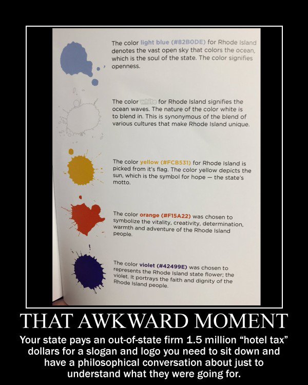
í Critical Response Workshop
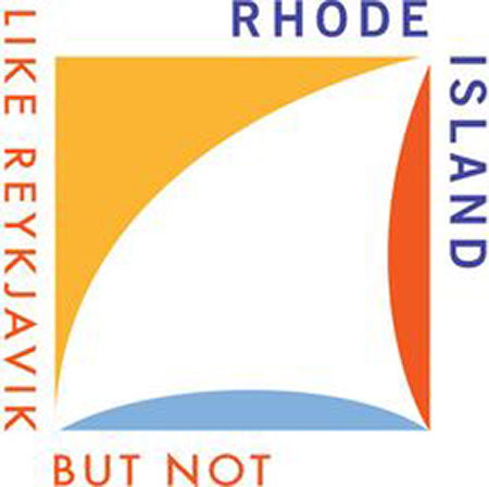
Project
Form a critical response to the new Rhode Island Tourism logo and/or campaign. Your response can be any media and take any form (and should not necessarily be a logo or campaign).
Meet in small groups to discuss and form a point of view, and then work collaboratively or individually to execute your critical response.
Post your work by 5:00 on the second floor for a walkabout immediately following.
Readings/Reference
RI Logo Controversy Press Coverage
NYTimes
The Guardian
AdWeek
AP
RI NPR
Design Community Reaction
Brand New Review
Reddit
Local reaction
Crowd-sourcing contest emerging
Local designers respond
RI Tourism
Visit Rhode Island website
RI Identity Presentation
Logo Design Presentation (alternate logos + taglines)
Other Destination Branding
“Best and Worst” Tourism Logos
Canada (Bruce Mau)
I love New York / Catskills (Milton Glaser)
Deep Reads
RI State Tourism Hearing
Internet Reaction
í Unit 10: Assignment
Choose a manual action to automate, or choose an automated process to make manual.
This assignment asks you to consider how what we make as designers effects human interactions on the micro and macro scale.
Note your everyday actions; go out of your way to notice where technology is present. When do human interactions occur? How would the introduction of automation enhance or hinder the interaction. What would the advantages or disadvantages be if automation took over? How can you use sarcasm, exaggeration, appropriated voice to make a point?
For next week: Make a Keynote presentation showing your source material, and propose various possible re-envisionings. Your proposal may use: other designer’s work as reference, texts, sketches, actual designs, etc.
How are the scenarios different? What is your point of view about technology’s social role through the project you are proposing?
Extended portion
Given the feedback you received from this week, adjust your concept (reinforce your values, rereread learning objectives) and start working on a prototype of your proposal. Make a ton of work.
f John
í Unit 9: Overview and Assignment
Question
How can we begin to communicate a complex idea or action using an economical
combination of words, type, and image?
Overview
Identity design is a critical skill practiced by graphic designers. Before an entity (be it a
company, organization, or cause) can create collateral, launch websites, pitch products
or conduct campaigns, that entity must have a well-conceived identity. A well-conceived
identity, however, is not just a memorable mark (logo), it is also a carefully considered
synthesis of language and typography, image and environment. For this unit, students will
attempt to encapsulate a socially responsible cause (e.g. light pollution, or eliminating
land mines) using a simple yet sophisticated combination of words, type, and image. The
resulting logos or logotypes may serve as a catalyst for further investigation into identity
systems, messaging, or audience engagement.
Learning Objectives
1 Week: Communicate a complex issue using minimal content and form (identity design)
3 Week: Add additional layers of content and form by creating an identity system or visual
language. Using your new visual language, explore unconventional methods and media for
communicating your cause.
Download write-up
Extended Portion
í Unit 8: Overview & Assignment
Question
How can we make the intangible tangible?
Unit Summary
You will find 50 ways to lend form to a common action or gesture. Designers today are tasked with inventing forms that address large abstract problems and communicate across multiple contexts. We will examine what happens when we use iteration as a way of making the intangible tangible, and discover how the process itself can be a material to build meaning with. Ultimately, this method of repetitive formal inquiry is a means to clarify and convey a nuanced idea.
Assignment
In class, you will receive an intangible action. Over the course of the week, investigate the action by creating 50 pieces that express, clarify the action to make it visible and tangible. Your goal is not only to explore multiple expressions of this action, but to force a reconsideration of its archetypal form through a process of iteration and experimentation.
In order to create a vast range of approaches, you should employ both traditional and non-traditional design tools—ranging from analog to digital—to create both static and dynamic executions. As you work, consider how each iteration and tool opens a unique opportunity to communicate something new and unexpected about this action, and do it in a novel way.
For next week, present all 50 visual expressions of your action in a 1920 x 1068 horizontal keynote presentation. Consider how the presentation of these iterations will work both individually and together, and potentially give insight into the tools and the process of how your worked.
Learning Objectives
—Use iteration as a means to understand/communicate nuanced content
—Create tangible form to convey intangible ideas
—Express an idea from multiple perspectives
—Gain comfort with a range of tools
—Present work and process to convey a story
Extended Portion (3 week portion)
How can we make the intangible into an app?
You will propose and design an app that uses your given action as its primary function. The app should deploy the action as a means to do something you care about in a faster, better, or more exciting way.
Approach the project in three steps:
1. Propose what the app does.
Write a brief description of what the app does, how it works, who it’s for, why it’s important.
2. Show what the app looks like.
Design the name and brand for the app (including the app icon, two basic screens and a poster announcing it.
3. Explain the use / outcome of the app.
Make short video or slideshow that presents and celebrates the use/outcome of the app. This will use elements from 1+2 above.
í Unit 7: Overview & Assignment
Question
How can designers distill a narrative to its essence?
Unit Summary
Designers are editors, interpreters, organizers, and remixers of meaning. In this content-rich world, we have the opportunity and obligation to communicate complex narratives using curated elements and visual shorthand; to infuse new meaning and point-of-view into the old; to capture something long and layered in an instant. In this unit, you will explore methods of making —including compression, deconstruction, abstraction, and translation—with the goal of telling a familiar story in a new way.
Assignment
By the end of today’s class, pick a narrative (book, film, tv show, play, etc) that you know very well. Reduce it to three collections of core elements—including (but not limited to) characters, places, events, themes, symbols, language, tropes, narrative arcs. Using the collections as content, visually represent the chosen narrative three times.
The final format of each collection is up to you, but should respond to the content (eg a set of characters might be presented in a family tree) and should not be the same form as the original narrative (ie don’t make a book about The Catcher in the Rye).
Considerations
—How much can you reduce the narrative and still capture the spirit of the original text?
—How can your point-of-view about the original be conveyed through your editing/design decisions?
—How could your narrative become information/data?
—How can your final output speak to audiences familiar and unfamiliar with the original?
Learning Objectives
—Edit content down to the most important components
—Embed a point-of-view into an existing piece of content
—Communicate complexity by applying economy
—Translate something old/familiar into something new/fresh
Extended Portion
Part 1: Extend, Develop, Refine
Option A (One): Develop your favorite approach from the first week into an extended narrative.
or
Option B (Many): Apply your favorite approach from the first week to a series (at least three) of additional narratives.
Part 2: Present, Document, Share
Title and document, and share your project with an audience (physically and online).
Timing /Deliverables:
Week 1
Option A:
—develop your approach into 3 distinct directions
—thoughts on final format
Option B:
—full list of new narratives
—design sketches for at least 3 (include at least 3 distinct design routes)
—thoughts on final format
Week 2
—project refinements
—format prototypes
—plan for part 2
Week 3
—final
í Unit 6: Overview & Assignment
Question: How does form shape content?
Unit summary: We will interpret an object by looking at it 13 different ways, thinking deeply about how its form shapes its meaning and content, and consider how form IS content in its own right. We will use Thomas McEvilley’s “Thirteen Ways of Looking at a Blackbird” as the basis for exploring objects from different formal perspectives.
One Week portion:
Read Thomas McEvilley’s “Thirteen Ways of Looking at a Blackbird.” Then go to the RISD Museum and pick one object on display. Using the 13 points in the essay as a basis, you will create 13 interpretations of this object in graphic form (graphic form is left deliberately open, and could mean posters, stamps, words on paper, marks on paper, video, photos, etc…). Each interpretation should be its own short quick project. Each interpretation should highlight that specific “way of looking” at each object.
Thirteen Ways of Looking at an object in the RISD Museum:
- Content that arises from the aspect of the artwork that is understood as representational
- Content arising from verbal supplements supplied by the artist, designer, curator or institution
- Content arising from the genre or medium of the artwork
- Content arising from the material of which the artwork is made
- Content arising from the scale of the artwork
- Content arising from the temporal duration of the artwork
- Content arising from the context of the work
- Content arising from the work’s relationship with art history
- Content that accrues to the work as it progressively reveals its destiny through persisting in time
- Content arising from participation in a specific iconographic tradition
- Content arising directly from the formal properties of the work
- Content arising from attitudinal gestures (wit, irony, parody, and so on) that may appear as qualifiers of any of the categories already mentioned
- Content rooted in biological or physiological responses, or in cognitive awareness of them
Additional Readings:
Michael Rock, Designer as author
Michael Rock, Fuck Content
Learning Objectives:
– develop ways of looking deeply at the world and objects within it
– develop a more complex understanding of the relations between form and content
– develop complex ways of looking at and interpreting content
– develop habits of iteration
– create a shared formal language
– create ways to approach the critique of work
Extended Portion
You will create a single work that communicates basic information (title, author, date, medium, dimension, any text available, etc…) about your selected object, along with at least two of your ways of looking. Use your one week explorations as the basis for your continued investigation, thinking about how some of these different explorations may be synthesized. Also think of what information you are communicating explicitly, and what aspects of the object you are communicating implicitly through your choice of form, typography, medium, distribution.
Week 1: Produce 3 different versions. Bring all three versions to class.
Week 2: Choose one version and refine it
Week 3: Final
í Unit 5: Overview & Assignment
Question:
How can a minute be defined by the designer and clearly understood by the viewing audience?
Overview:
TIME is one of the fundamental constructs of human experience. As designers, it is an essential in shaping both our processes and our products. We communicate by creating hierarchies — how a viewer encounters a sequence of events, how long it takes the eye to scan a fixed two dimensional surface (an image, text, diagram, etc.), the pacing and order in which our designs are viewed—all of these considerations are the foundation for constructing creative and dynamic visual communication.
The role of time in Graphic Design continues to expand and contract in all sorts of ways. There is more to comprehend, less time to spend on each encounter, greater networks to span, and larger audiences to reach.
Learning objectives:
– Perception: To develop a critical awareness of how time affects the reading of a design.
– Framing: To understand how framing (composition, in particular) affects meaning.
– Editing: To play with sequencing as a critical component to narrative
– Production: To be subjected to and practice with movie editing software
Assignment:
How can a minute be defined by the designer and clearly understood by the viewing audience? Make a video that lasts anywhere between 45 seconds and 1 minute and 30 seconds; QuickTime FORMAT (.MOV; H.264; 720p)
Movies should ideally be less than 100MB, with dimensions no larger than 1280×720.
Movies larger than 250MB will be rejected.
Movies should follow this naming convention: instructorlastname_yourusername.mov (ex: wedell_jpark01.mov)
Your name and instructor’s name should also appear at the beginning of your film.
Kickoff: November 17th
First Review: November 24th in section
Final presentations: December 1st
NOTE: Deliver videos to John Sunderland (3rd floor Type Shop) by 1PM MONDAY NOVEMBER 30th
í Unit 4: Overview & Assignment
QUESTION
How can collaboration be a catalyst for making?
OVERVIEW
Collaboration is important across many fields of creative work and the discoveries made through it can be invaluable. This unit promotes methods that emphasize teamwork, spontaneity and responsiveness. You will see how methods of shared creativity can produce a form of knowledge that is experiential and intuitive.
Students will develop a discrete visual vocabulary and system. These systems will then be shared with all DS1 students to create a shared lexicon that may be mined endlessly. We will recontextualize, synthesize, transform and conspire, working in and on top of each other’s work. We will build on remix practices, which blur distinctions between invented and borrowed work.
ASSIGNMENT
Week One: SET OF PARTS AND APPROPRIATION
After introducing this unit each student is given a word. Use this word as a starting point for inspiration and media to be explored.
Next build a complex set of visual parts (total: 50) to share with all students in DS1.
Use this assignment as an opportunity to develop a language of personal symbolism.
Use any available resource found and/or self-authored: photos, scans, drawings, video, etc. Your visual vocabulary will include but not be limited to: shape, perspective, color, line weight, scale, foreground/background, level of abstraction, etc.
This unit is structured to provide an opportunity to collaborate and extend the process of design from self to collective.
You will design 2 posters that are due week one of this unit. (printed or pdf)
- Highlights and applies all 50 visual parts that you created.
- Create a hybrid that borrows/appropriates visual parts from the collective. Use any module of your choosing.
PROCEDURE
Determine methods, techniques, media, etc. you plan to work with. Explore and perform studies using a variety of 2D and 3D materials and processes. Look at ways of hybridization and translating one medium into another. (Physical and Digital)
- – Create a set of visual parts. (possibly interchangeable)
- – Explore a variety of tools and processes. (at least 5)
- – Explore (at least 10) different form factors. (refer to posted list)
- – Be exhaustive, create multiples, aim for quantity and variety.
- – Carefully consider contrast, figure/ground, composition and gestalt principles.
- – Be economical with the combination of elements. Reduce to basic elements.
- – They should work together as a system (similar scale, level of detail, grid, etc.)
- – Screen grabs and stills may be taken from video and motion work.
DELIVERABLES
You will receive an invitation via email to a shared Google Drive. Save your set of parts to the Google Drive in preparation to share with classmates by Noon on Saturday, October 31st, 2015.
- – Group all vectors into one Illustrator file.
- – Save images as individual jpg files. Scale should be at least 4 x 4 inches, 300 dpi.
- – Use this format for naming and numbering of files: email username_1.jpg
- – Present (2) 30 x 42 inch designed posters
- – Display at the beginning of class on Tuesday, November 3rd
Week Two: EXCHANGE
For this part of the assignment you will work in pairs.
Create a poster diptych that is a response and reinterpretation of your partners work. Expand it through analysis and experimentation. Recontextualize, synthesize, transform and conspire, refine the system, work in and on top of each other’s work. This process can shift your thinking and may uncover unforeseen relationships.
- – Consider exploring methods of sorting, adding and subtracting.
- – Look at ways to connect seemly-unrelated ideas.
- – Visual responses during this phase of the assignment may totally transform.
- – 2 posters (diptych) 30 x 42 inch due: Tuesday, November 10th
Working together in section:
- Dissect week one’s outcome. What themes emerged?
- What methods and mediums were most successful?
- Does your partner’s work contrast or compliment yours?
- What methods of your own devising will you continue to employ? Can you achieve a successful hybrid?
- Will you enhance or destroy?
- Look for relationships between things to see what emerges. What are the commonalities?
- How can you creatively combine and connect totally disparate elements? Taking something out of a context and placing it into another, demonstrates how meaning is fixed and how meaning is unfixed when location is changed. What does it mean in its new situation?
- Analyze outcomes, transform, hybridize, change parameters, explore in depth.
- How does working collaboratively alter your approach?
Week Two Critique in Section:
- How were your original intentions interrupted?
- How was work transformed by the conversation?
- Do you feel ownership of something that was not originally yours?
- Take note of benefits and pitfalls.
- Were your results consistent or were there pivotal moments?
REFERENCES
Martin Venezky, Sol Lewitt, Stephen Wolfram, Karel Martens, Barry McGee, Miranda July
https://en.wikipedia.org/wiki/The_Five_Obstructions
http://www.1000journals.com/journals/
LEARNING OBJECTIVES
Collaborative working methods, Flexibility, Intuition, Spontaneity, Respect and Trust, Working with Constraints, Fragmentation, Gestalt, Abstraction, Appropriation, Conveying ideas through minimal means, Explore processes and media, Hybridization/working across platforms, Representation and Meaning
í Unit 3: Overview & Assignment
Question:
How can the graphic medium enhance and enrich the verbal message?
Overview:
In our engagement with the world around us, and our routine to “make sense” out of complexity, we take for granted the perceptual and holistic principles this interaction involves. That perception of parts and configurations as a holistic system, or language, depends greatly on the use of socalled “gestalt” principles (i.e., figure-ground, similarity, closure, etc.) and how these serve the purpose to communicate. Since graphic design presents ideas primarily via graphic means, awareness of these perceptual principles is critical for designers to help their products stimulate clarity and unity, curiosity and interest, inquiry and insight. We will look into this power of graphic design to discover how an abstract (non-visual) object like a “word” (a verbal means to represent an idea) can be enriched significantly toward a deep sense of poetic insight due to its graphic/visual delivery, and thus provide a lasting impression of value for the ideas it holds.
Learning objectives:
— Develop visual sensibilities
— Learn about “gestalt” principles and their holistic system as “language”
— Observe the power of the visual to affect the non-visual
— Develop mind-mapping skills
— Become aware of the practice to design for experience
Download the assignment as pdf
Download the lecture notes as pdf
í Unit 2: Overview & Assignment
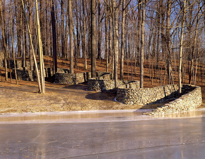
Andy Goldsworthy, Storm King Sculpture Park
I suspect no landscape, vernacular or otherwise, can be comprehended
unless we perceive it as an organization of space; unless we ask ourselves
who owns or uses the spaces, how they were created, and how they change.
—John Brinkerhoff Jackson
Preface:
Although graphic design exists in a multitude of spaces, places, and surfaces, it is too often seen as a two-dimensional enterprise. But in fact our work is entirely multi-dimensional. Not only do we design places, wayfinding systems, and exhibits, we also design information environments, complex digital networks, and social interfaces. Moreover, what we produce exists in real time, and real space, used by real people in all dimensions. Designers are experts at reading signs and signals within any situation, large or small. We analyze and record given characteristics, and intervene to change or improve upon circumstances. Design is nearly always engaged with altering, or re-organizing, or improving upon, a given circumstance or set of circumstances, whether at a macro or micro scale.
Lawrence Weiner
Assumptions:
Humans are hard-wired to read signs and signals in any given situation. As we move through our environments, we intuitively and unconsciously look for comfort, safety, and elements that are of value or pertain to us. We avoid danger and discomfort. We are egocentric, but we are also intelligent and quick to read our surroundings. We “read” all manner of spatial form, color, tone, temperature, sensation, sounds, and any number of other characteristics of a place almost instantaneously. We are extremely perceptive and are inclined to find meaning in most things. In this Unit, we will be looking at how we “read” spaces and places, and we will explore how we might intervene upon existing spaces. Our interventions will be a form of discovery — a process for understanding contrasts, narrative, form, and the human desire to form interpretations. As we work for the next two weeks, we will discuss in our sections how we define place; how a place relates to its surroundings; how we embrace the culture of a place, large or small, or how we might subvert its histories and realities.
Jessica Greenfield, RISD MFA alum
Unit Question: How can you alter an existing space (site)?
Additional questions:
-How can you truly “know” a place?
-By altering a site, can you create a new narrative read of the site?
-How does the way you approach the alteration, and the way you frame your documentation of the intervention, affect the “read” of your site.
-How can you document, sequence, and explain your site interventions to create a narrative out of the documentation?
Deliverables:
A designed sequence/presentation (media is open) of your documentation that explains your sites and your alterations to a public audience (us).
Learning Objectives:
1) Getting to know your city and environs.
2) Develop a consciousness about how we define space, place, site, landscape, culture, audience, community
3) Exploration of how formal elements work together, whether in contrast or concord; harmony or discord.
4) Developing resourcefulness around finding unusual and surprising materials or objects to bring to a site for the creation of a new or alternative “read.”
5) Developing an awareness of the power of the artifact/after-the-fact documentation. “How to tell a story for those who werent there.”
Procedure:
- You must choose two sites.
One must be an intentionally built / urban / public / site. Outdoors.
One must be a natural (relatively unbuilt or naturally occurring) environment.
(for example, the RISD’s Tillinghast farm, or (walking distance) Swan Point Cemetery’s woods, or Lincoln Woods State Park, or Weetamoo Woods in Tiverton.) - You must deliberately and attentively get to know your two sites. You should record all manner of characteristics pertaining to your sites. Using photography and other recording techniques, take note of the site’s characteristics, forms, materials, textures, sensations, light, uses, users, sounds, temperatures, intentions. You can also consider cultures, histories, stories, pasts, futures. What was the site. Does it have a past? A future? What can it be? Get to know these two places thoroughly. Think Macro and Micro. Record context and adjacencies. Record edges and boundaries. Record before and after your alterations.
Pay attention to how you frame your recordings/images. How you light or edit your images. How will your technique affect the way an audience might understand your site’s inherent narrative. Show us how you want us to see the site. Show us how the site communicates.
Before the next class meeting you must alter your two spaces in the following ways, and create carefully considered documentary images and recordings:
A.
Transform or intervene upon an existing, built, urban space/place
1) Intervene with color (material is open)
2) Intervene with multiples (more than 25)
3) Intervene with something singular
4) Intervene with language / text / type
B.
Transform or intervene upon a natural space/place:
1) Intervene with language or color or multiples or other items you bring to the place
2) Intervene only with things that you find at the site
RECORD EVERYTHING (photo, video, sound, drawing)
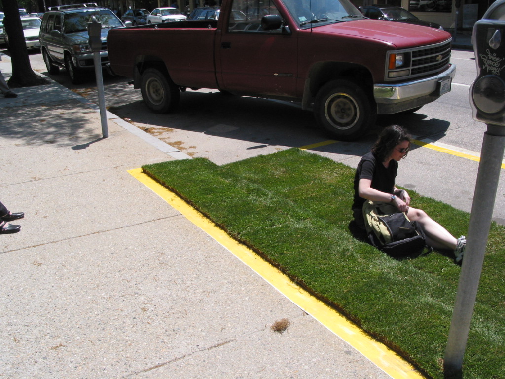
RISD GD Student Work
C.
Design your Documentation
for 10/6/15
Bring to class a multitude of images and evidentiary records/documents and begin building a sequential narrative that can communicate to those who were not there exactly what took place; what they might find there if they could be there. Media is open but the sequence of your narrative and how you show a visual flow is to be considered.
for 10/13/15
Bring in refined presentations of your interventions in a narrative sequence of images and texts as needed. These need to resonate with your audience (all of us) in a public viewing, and help us understand the whole sequence of your space alterations.
Required Reading:
Lucy Lippard Lure of the Local
Brief overview of Maya Lin’s work Here
Resources:
RISD Second Life
Resources/Recycling for RI Education
í DS1 Reflective Notes
Reflective Tasks
Tom O’s: notes for regular “reflective” practice
Write Daily/ Weekly Reflective Notes:
Knowing (learning) evolves from a dynamic interplay between experience and reflection.
Reflection deepens awareness and insight.
Therefore, make it a daily practice to nurture reflective practice via written notes on your course (this one or others) work and readings: your curiosities, interests, questions for inquiry, delights, challenges, observations, experiences.
Create a quiet moment (if only for a few minutes!), for to act from a quiet mind fosters true insight.
Write spontaneously.
Write, but also feel free to add visual notes, as needed.
Savor this experience of insight.
ALSO: each week share one or more of your reflective notes on work for this course,
via our course blog, and with your section faculty via email!.
Sharing your “insights” allows us (faculty) to be more informed of you:
your interests, thinking and processing of ideas.
Meant as “nothing to prove” but as evidence of your attention to your work, don’t expect a response/critique.
Don’t belabor the task (this is not an English class, not a thesis, not a test!).
Keep writing effortless and simple, in topic and style.
No need to impress anyone with excessive facts or knowledge.
Use any writing style that feels comfortable and natural to you.
Simply practice this reflective mode with sincerity.
NOTE: This practice will also help you toward the final course requirement,
which is to create a Reflective Process Book about your work and what you learned in this course.
í Unit 1: Due week 3
In your group meetings today, you should have honed in on the most striking observations and/or recordings. For next week, focus your attention on a singular curiosity and create five forms (but not necessarily objective) that communicates the value of your attention in that area.
f John
í Unit 1: Day 1, In-class

The Bohemian Dinner, Charles Greene Shaw
Head out to the Independence Trail. Choose a spot and through close looking and careful observation, make as long of a list as possible that describes what you see. What are all the ways you can describe both big and small, natural and man-made, temporary and permanent, boring and extraordinary? At what point do your observations depart from what is objectively there to associations/opinions from the point of view of the maker. Make note of those as well.
Come back before the end of class. If there’s time, split into groups of 3 or 4 and read through/share your lists. Make sure you choose a spot and start.
Your text document should take the form of a hand-written list on letter-sized paper so that it can be share with your groupmates and pushpinned on the wall at the end of class for general class or small group review. The exercise should demonstrate the range of possible observations and start to suggest where value lies in the everyday urban observation. How objective and subjective are the observations, and what ideas arise from any of it? Camera phone your list and place on Google Drive/website (what your instructor suggests) by the end of the unit.
f John
í Unit 1: Due week 2
Pick one spot in the city and begin to think of it as yours. It doesn’t matter where, and it doesn’t matter what. A street corner, a subway entrance, a tree in the park. Go to to your spot every day at the same time. Spend an hour watching everything that happens to it, keeping track of everyone who passes by or stops or does anything there. Take notes, take photographs. Make a record of these daily observations and see if you learn anything about the people, or the place, or yourself.
—‘The Rules of the Game,’ Paul Auster to Sophie Calle
Let’s play by Paul Auster’s rules. Choose one of the 50 spots on Providence’s “Independence Trail” as your spot. The historic significance of the Independence Trail serves as a note of possible contrast with what you will see in today’s Providence, but for the most part, it’s a system of spots.
You are learning to work with what already exists, before you do anything. Using all of the following recording techniques, create an exhaustive amount of documentation of the area surrounding your spot (100 documents minimum). You may move from your spot to record or further inspect, but limit your field of attention to what you can see from the spot you choose from the below map. Note the word exhaustive is meant to force you to deeply engage with your area. Go to your spot a minimum of three times for at least an hour each time. As far as recording, some media may make more sense than others based on what grabs your attention. Notes may work better than images in some places or cases (nighttime). Be sure to spend a good deal of time not recording anything at all. A recording is often the result of seeing not a mediator of what you see. Experiment with all of the following:
- Photography (in all its permuatations)
- Diagrams
- Sketches
- Lists
- Narrative paragraph
- Audio
- Video
- iPhone apps?
Present your findings to your classmates in section at the start of class next week in an organized fashion. Pin up what can be pinned up, have a laptop out for digital assets, make sketches visible, etc. We will look at the results briefly as a group, then work in smaller groups to discuss how well the forms you made are communicating what you saw. Address this line of questioning when you show your work: What did you notice of value? What did you decide to share? How did the way you recorded and shared your observation make sense given what you saw and what you want to say?
Everyone should be set up by the beginning of class.

This first unit is meant to kickstart best practices and ongoing forms that you will use in the next two years. Buy and begin using a sketchbook (letter-sized or smaller), set up a blog (specifically for this class, not Instagram or Pinterest… tumblr is ideal) and begin to reflect and document your experiences in a way that will make your final documentation go smoothly.
f John
Unit 01: John Caserta
What is important about what you see — and how can you communicate it to those who weren't there?
8 posts
Unit 02: Lucinda Hitchcock
How can you alter an existing space (site)?
| September 27, 2015 |
Unit 2: Overview & AssignmentLucinda Hitchcock |
|
| October 7, 2015 |
Unit 2: Encouragement / AdviceLucinda Hitchcock |
|
| October 13, 2015 |
w Unit 2: Critique FormatLucinda Hitchcock |
3 posts
Unit 03: Tom Ockerse
How can the graphic medium enhance and enrich the verbal message?
| October 13, 2015 |
Unit 3: Overview & AssignmentTom Ockerse |
|
| October 15, 2015 |
B Examples of typographic imagesLucinda Hitchcock |
|
| October 18, 2015 |
w Lecture: Word as ImageTom Ockerse |
|
| October 18, 2015 |
w Concrete Poetry ManifestosTom Ockerse |
|
| October 18, 2015 |
w Supplementary links and notes for unit 3Tom Ockerse |
|
| October 18, 2015 |
w Formal definitions and principlesMichelle Bowers |
6 posts
Unit 04: Michelle Bowers
How can collaboration be a catalyst for making?
| October 27, 2015 |
Unit 4: Overview & AssignmentMichelle Bowers |
1 b |
| October 28, 2015 |
w Unit 4: LectureMichelle Bowers |
|
| November 10, 2015 |
w Why I, Tom Wedell, love postersTom Wedell |
3 posts
Unit 05: Tom Wedell
How can a minute be defined by the designer and clearly understood by the viewing audience?
| November 17, 2015 |
Unit 05: Clips referencing timeMichelle Bowers |
|
| November 17, 2015 |
B Unit 5: Required ReadingsTom Wedell |
|
| November 17, 2015 |
Unit 5: Overview & AssignmentTom Wedell |
|
| December 1, 2015 |
Videos to check outJohn |
Shown in class on Week 12 |
4 posts
Unit 06: Clement Valla
How does form shape content?
| February 17, 2016 |
Unit 6: Overview & AssignmentClement Valla |
|
| February 18, 2016 |
Unit 6: LectureClement Valla |
2 posts
Unit 07: Dinah Fried
How can designers distill a narrative to its essence?
| February 25, 2016 |
Unit 7: Overview & AssignmentDinah Fried |
|
| February 26, 2016 |
Unit 7: LectureDinah Fried |
2 posts
Unit 08: Joe Marianek
How can we make the intangible tangible?
| March 3, 2016 |
Unit 8: Overview & AssignmentJoe Marianek |
1 posts
Unit 09: Rich Rose
How can we begin to communicate a complex idea or action using an economical combination of words, type, and image?
| March 10, 2016 |
Unit 9: Overview and AssignmentRich Rose |
|
| March 10, 2016 |
w Unit 9: LectureRich Rose |
|
| March 23, 2016 |
w “Not Diving but Swimming,” Michael BierutJohn |
3 posts
Unit 10: John Caserta
What do the technical choices we make say about our values and what we want from society?
| March 17, 2016 |
Unit 10: AssignmentJohn |
|
| March 17, 2016 |
B Unit 10: Optional ReadingsJohn |
|
| March 17, 2016 |
Unit 10: Overview & KickoffJohn |
|
| March 18, 2016 |
w “How I Found the Human Being Behind Horse_ebooks…”John |
From Gawker |
| March 18, 2016 |
w Unit 10: Lecture SlidesJohn |
|
| March 18, 2016 |
From writer and AI dissenter, Evgeny MorozovJohn |
|
| March 21, 2016 |
w Creative AIJohn |
Via Chris Novello |
| March 25, 2016 |
How I built a toaster – from scratchJohn |
8 posts
Unit 11: Paul Soullelis
How does design make sense of so much stuff?
| September 26, 2016 |
Unit 11: Paul SoulellisPaul Soulellis |
1 posts
Unit 12-Lucinda Hitchcock
— How can designers map? — How does Mapping lead to Maps, and how can maps lead to new ways of seeing?
| October 3, 2016 |
Unit 12: Overview & AssignmentLucinda Hitchcock |
1 posts
Unit 13: Hammett Nurosi
How can design be persuasive?
| December 9, 2016 |
Unit 13: Persuasion / Overview & AssignmentLucinda Hitchcock |
1 posts
Unit 14: Jacek Mrowczyk
Can design change anything?
| December 9, 2016 |
Unit 14: Jacek MrowczykLucinda Hitchcock |
1 posts
Åw Sophomore review schedule
w Sophomore review schedule May 5, 2016
Åw Sophomore review info
w Sophomore review info May 5, 2016
Åw “How Kanye West Taught Me to Stop Worrying…”
w “How Kanye West Taught Me to Stop Worrying…” April 19, 2016
Åw How abstract?
w How abstract? April 14, 2016
Åw “Critical of what?”
w “Critical of what?” April 14, 2016
Åw “Not Diving but Swimming,” Michael Bierut
w “Not Diving but Swimming,” Michael Bierut March 23, 2016
Åw Creative AI
w Creative AI March 21, 2016
Åw Unit 10: Lecture Slides
w Unit 10: Lecture Slides March 18, 2016
Åw “How I Found the Human Being Behind Horse_ebooks…”
w “How I Found the Human Being Behind Horse_ebooks…” March 18, 2016
Å
B Unit 10: Optional Readings
Required for March 24
“Art in the Age of Machine Intelligence”, Blaise Aguera y Arcas
Extended bibliography
The Doomsday Invention, The New Yorker
“Will Your Job Be Done by a Machine,” NPR
“Automation Makes us Dumber“, WSJ
“Harnessing algorithms to create shape-change typography,” Wired
Nicholas Carr: The Glass Cage: Automation and Us (also see: video overview)
Lewis Mumford “Art & Technics”
Miranda July’s “Somebody” app & miu miu video
Dunne & Raby Speculative Everything
Anthony Dunne lecture: “What If: Crafting Design Speculations”
Jon Sueda, Ed. All Possible Futures
Eugeny Morozov. To Save Everything, Click Here: The Folly of Technological Solutionism.
N. Joseph Woodland, Inventor of the Bar Code, Dies at 91
“The Machines Are Coming”, The New York Times. An op-ed by Zeynep Tufekci. More writings by her on her website and on Medium
f John
Åw Unit 9: Lecture
w Unit 9: Lecture March 10, 2016
Åw DS2 Syllabus
w DS2 Syllabus February 17, 2016
Åw Why I, Tom Wedell, love posters
w Why I, Tom Wedell, love posters November 10, 2015
Åw Unit 4: Lecture
w Unit 4: Lecture October 28, 2015
Åw Formal definitions and principles
w Formal definitions and principles October 18, 2015
Åw Supplementary links and notes for unit 3
w Supplementary links and notes for unit 3 October 18, 2015
Åw Concrete Poetry Manifestos
w Concrete Poetry Manifestos October 18, 2015
Åw Lecture: Word as Image
w Lecture: Word as Image October 18, 2015
Å
B Examples of typographic images
http://vincentperrottet.com/ (amazing french poster designer)
http://fromkeetra.com/ (a playful wordsmith / designer I know and love)
http://thisiscolossal.com/?s=typography (that crazy site where you can find a dizzying amount of too much cool stuff )
http://www.thisiscolossal.com/2010/11/hand-cut-typography/ (a lovely thoughtful project)
http://www.thisiscolossal.com/2010/10/paper-alphabet-for-sculpture-today/
http://www.tm-research-archive.ch/ (beautiful archive of swiss typographic covers for a type magazine series from the 70s/80s)
http://beautifuldecay.com/2014/07/25/words-leap-page-3d-calligraphy-art-tolga-girgin/
http://www.edruscha.com/featured-works/ (world famous painter/artist lover of words)
https://www.youtube.com/watch?v=m86ae_e_ptU (OK-Go music video; if you dont like their music just turn the volume down)
http://www.synopticoffice.com/project.php?projectid=1&selectedcol=1
http://www.ok-rm.co.uk/project/the-billboard-book-project-jonathan-monk (great UK studio project: about scale, proportion, type)
http://balladora.blogspot.com/ a very well curated typography blog with a deep archive.
also look up HN Werkman, and also enjoy this
http://monoskop.org/images/8/8b/Riddell_Alan_ed_Typewriter_Art.pdf
https://www.are.na/share/GMgWhBK (From JC)
Åw Unit 2: Critique Format
w Unit 2: Critique Format October 13, 2015
Åw RI Resource/Recycling Center (ie weird free stuff and lots of it)
w RI Resource/Recycling Center (ie weird free stuff and lots of it) September 24, 2015
Åw Helpful List of Formats, Process and Concepts
w Helpful List of Formats, Process and Concepts September 24, 2015
Å
B Unit 1: Readings
Required
“Attention,” Lorraine Daston. Curiosity and Method: Ten Years of Cabinet Magazine
“An Attempt at Exhausting a Place in Paris,” Georges Perec
“Approaches to What?” Georges Perec
“The Rules of the Game,” Paul Auster and Sophie Calle
Supplementary
Video clip from “Smoke” adapted from Paul Auster short story
Interview with Katerina Seda
The Everyday, WhiteChapel Documents of Contemporary Art

f John
 John
John
David Lynch on how observation leads to ideas August 31, 2016
 michellebowers
Unit 05: Clips referencing time November 17, 2015
William Kentridge
Un Homme Qui Dort
The Man Who Sleeps – Bernard Queysanne
Christian Marclay
https://www.youtube.com/watch?v=xp4EUryS6ac
Time in terms of “timing” of sound an image (abstraction)
1935-1937 Len Lye – “Kaleidoscope”
A Colour Box – hand painted film
https://archive.org/details/A_Colour_Box
Trade Tattoo
An Optical Poem – produced by Oskar Fischinger 1938
https://www.youtube.com/watch?v=they7m6YePo
John Whitney
Walter Ruttmann – Lichtspiel Opus 1,2,3,4 -The first abstract film screened publicly – 27 April 1921
https://www.youtube.com/watch?v=od0MxuD4xxQ
Symphonie Diagonale Viking Eggeling
Hans Richter – Rhythm.21
https://www.youtube.com/watch?v=QEgULqLn5iU
“Ballet mecanique” (1924)
Time as in sequencing (complex sequencing / Spacial relationships)
Maya Deren – ritual in transfigured time
https://www.youtube.com/watch?v=0IG5K65gkTU
(should be watched with no sound)
“Meshes of the Afternoon” (1943) Short Film
http://www.metacafe.com/watch/5412965/meshes_of_the_afternoon_1943_short_film_public_domain/
Witch’s cradle (Maya Deren , M. Duchamp – 1943)
https://www.youtube.com/watch?v=_9z6_DA-tqU
Corti surrealisti Man Ray Fernand Leger & Marcel Duchamp, 1923 1929
Early animation + Linking image with sound
Silly Symphony (was the beginning of animation/ disney + where they were able to link up the image with the sound for the first time)
Gertie the Dinosaur
https://www.youtube.com/watch?v=TGXC8gXOPoU
First Silent FilmThe Lumiere Brothers – “Arrival of a Train at La Ciotat” – First silent documentary film – (1896)
https://m.youtube.com/watch?v=d_9N68MO9gM
Timing based on Actor in a Scene
Harold Lloyd’s “Safety Last”- 1923
Films That Rely on timing but are empty
Structuralist film
Wavelength (Michael Snow, 1967)
Andy Warhol’s Empire
https://www.youtube.com/watch?v=VMCeDBn1Zu0
Warhol eating a burger
https://www.youtube.com/watch?v=Ejr9KBQzQPM
Contemporary Artists video:
David Lynch
https://www.youtube.com/watch?v=6WQzCFXoGoc
Bill Viola
https://www.youtube.com/watch?v=E7a8R8Oynj4&list=PLA228CFF516FAD624
Nam June Paik
Ann Hamilton
http://www.annhamiltonstudio.com/videosound/aleph_video.html
 lhitchco
Unit 14: Jacek Mrowczyk December 9, 2016
Q: Can design make a difference?
How and to what extent can design change, or influence the world around us? There have never been times like these: technology, politics, environmental challenges, and social unrest are colliding with remarkable force, shaking the earth and its inhabitants to the core. Can designers make a difference in this complicated world, and if so how? We often hear about design as a tool for change. This Unit asks you to question this premise, to look closely at the world around you, at both large and small-scale issues, and identify areas where design has made change.
For Mon. Nov. 14th
Define the area of design activity (what the project refers to, e.g. improving visual communication of public transport system, discrimination, freedom of speech in the academic units, helping the homeless, hate speech in politics, revitalization of town districts, activating the local community, recycling & environment). Where do you want to have impact? Research into existing solutions (what requires improvement/intervention).
Fill a table with your research. Use the table as your platform to demonstrate the problem.
Learning Objectives
– learning to think critically
– learn to work with unconventional media to create heightened experiences for audiences and users
– develop a critical outlook within the discipline of graphic design
– learn to critically investigate socially involved graphic design (ideology/propaganda/activism)
– define areas where graphic design directly affects users awareness
– paying attention to how design activates social awareness
– consider how to intervene or subvert daily routines in order to communicate a new angle on an existing problem
For Wed. Nov. 16th
Developing three initial concept/solutions designs (sketches, descriptions), including a proper strategy for possible intervention. Print results (any format) and fill a wall surface with your proposals.
For Mon. Nov. 28th in-class
Preparing a presentation (keynote/pdf) of selected initial concept. The presentation should include:
- detailed project description
- implementation strategy/action (for example intervention in public space)
- project’s impact on the surroundings/environment (how the design should work)
- assumed process, changes/results
- suggested project efficacy evaluation method
For Wed. Nov. 30th small groups/brief walk about
Prototype the preliminary design of the implementation strategy/action
For Mon. Dec. 5th/rotate teachers
Presentation of documentations from intervention/action.
For Wed. Dec. 7th/final crit
Walk about / project presentation
Presentation of project’s documentation.
Reading: “Research and Destroy” by Daniel van der Velden
 twedell
Unit 5: Overview & Assignment November 17, 2015
Question:
How can a minute be defined by the designer and clearly understood by the viewing audience?
Overview:
TIME is one of the fundamental constructs of human experience. As designers, it is an essential in shaping both our processes and our products. We communicate by creating hierarchies — how a viewer encounters a sequence of events, how long it takes the eye to scan a fixed two dimensional surface (an image, text, diagram, etc.), the pacing and order in which our designs are viewed—all of these considerations are the foundation for constructing creative and dynamic visual communication.
The role of time in Graphic Design continues to expand and contract in all sorts of ways. There is more to comprehend, less time to spend on each encounter, greater networks to span, and larger audiences to reach.
Learning objectives:
– Perception: To develop a critical awareness of how time affects the reading of a design.
– Framing: To understand how framing (composition, in particular) affects meaning.
– Editing: To play with sequencing as a critical component to narrative
– Production: To be subjected to and practice with movie editing software
Assignment:
How can a minute be defined by the designer and clearly understood by the viewing audience? Make a video that lasts anywhere between 45 seconds and 1 minute and 30 seconds; QuickTime FORMAT (.MOV; H.264; 720p)
Movies should ideally be less than 100MB, with dimensions no larger than 1280×720.
Movies larger than 250MB will be rejected.
Movies should follow this naming convention: instructorlastname_yourusername.mov (ex: wedell_jpark01.mov)
Your name and instructor’s name should also appear at the beginning of your film.
Kickoff: November 17th
First Review: November 24th in section
Final presentations: December 1st
NOTE: Deliver videos to John Sunderland (3rd floor Type Shop) by 1PM MONDAY NOVEMBER 30th
 tockerse
w Supplementary links and notes for unit 3 October 18, 2015
 jmariane
Critical Response Workshop April 14, 2016
Project
Form a critical response to the new Rhode Island Tourism logo and/or campaign. Your response can be any media and take any form (and should not necessarily be a logo or campaign).
Meet in small groups to discuss and form a point of view, and then work collaboratively or individually to execute your critical response.
Post your work by 5:00 on the second floor for a walkabout immediately following.
Readings/Reference
RI Logo Controversy Press Coverage
NYTimes
The Guardian
AdWeek
AP
RI NPR
Design Community Reaction
Brand New Review
Reddit
Local reaction
Crowd-sourcing contest emerging
Local designers respond
RI Tourism
Visit Rhode Island website
RI Identity Presentation
Logo Design Presentation (alternate logos + taglines)
Other Destination Branding
“Best and Worst” Tourism Logos
Canada (Bruce Mau)
I love New York / Catskills (Milton Glaser)
Deep Reads
RI State Tourism Hearing
Internet Reaction
 cvalla
Unit 6: Lecture February 18, 2016
 rrose
rrose
w Unit 9: Lecture March 10, 2016
 dfried01
Unit 7: Lecture February 26, 2016
 psoulell
DS3 Syllabus September 26, 2016
-
Instructors
John Caserta Michelle Bowers Lucinda Hitchcock Tom Wedell Tom Ockerse Joe Marianek Clement Valla Rich Rose Dinah Fried Paul Soulellis Jacek Mrowczyk Hammett Nurosi Ben Shaykin James Goggin Sections
- Announcement (2)
- Assignments (20)
- Lecture (7)
- Links (20)
- Outline (44)
- Unit 01: John Caserta (8)
- Unit 02: Lucinda Hitchcock (3)
- Unit 03: Tom Ockerse (6)
- Unit 04: Michelle Bowers (3)
- Unit 05: Tom Wedell (4)
- Unit 06: Clement Valla (2)
- Unit 07: Dinah Fried (2)
- Unit 08: Joe Marianek (1)
- Unit 09: Rich Rose (3)
- Unit 10: John Caserta (8)
- Unit 11: Paul Soullelis (1)
- Unit 12-Lucinda Hitchcock (1)
- Unit 13: Hammett Nurosi (1)
- Unit 14: Jacek Mrowczyk (1)
- Readings (11)
- Resources (6)
Syllabi
-
About
Core undergraduate graphic design studio at Rhode Island School of Design
